Pre-order your copy of Pink Mince #7 — The Funny Pages — and get your hands on a copy as soon as it arrives back from the printer! (Or pick up a 6-issue subscription and always get the latest copy.)
Ragtag grab-bag

Pre-order your copy of Pink Mince #7 — The Funny Pages — and get your hands on a copy as soon as it arrives back from the printer! (Or pick up a 6-issue subscription and always get the latest copy.)
April Fool’s Day is probably a bad time to make a major announcement, but I swear this one is for real. As of today, I am employed full-time as a senior type designer at Monotype Imaging, based out of our office in Salfords, a bit south of London. (I live and spend most of the time working in London itself, however.) I will probably spend most of my time for the next few months continuing to work on Indic typefaces, and doing a bit more speaking about type design and typography. And actually getting paid for it. Is that awesome or what?
Hooray! Did you know that I’ve spent the last few months whining about my work visa issues, and living back in New York while I waited for all this to fall into place? After working for two years on a collaborative project between Monotype and the University of Reading, and then waiting for the visa stuff to get sorted, I feel like I have finally completed the longest job interview of my life. I am relieved, and excited.
[Note: This is as good a time as any to point out that this is my personal web site, though, where I generally speak off the cuff, and occasionally talk some shit. Those opinions are mine, not the company’s. Obviously.]
GAY TYPOGRAPHY ALERT!
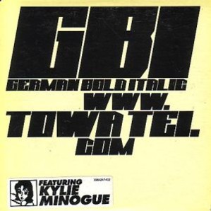
If you are a regular here at Ultrasparky, then there’s a good chance you’re either a type nut, or kind of a homo. (Those are both wonderful things, and I applaud for either. You may still be lovely even if you are neither.) If you are either of those things, there’s a chance you’ve heard this song. If you are both of those things, than I would be horrified if you were not aware of this beautiful moment in time when Towa Tei (formerly of Deee-Lite) got Kylie Minogue to sing a song about a typeface.
Not to brag or anything, but I have been obsessed with this song since the moment it was released in 1998. It may have been the first time I ever encounted Kylie Minogue, and it’s still the only thing of hers I really love. [Note, added 11/27/2024: What the hell was I thinking? Kylie Minogue is iconic and it pains me that I didn’t think so at the time.] The original CD shipped with a font called German Bold Italic, but as you can see, it was dreadful:
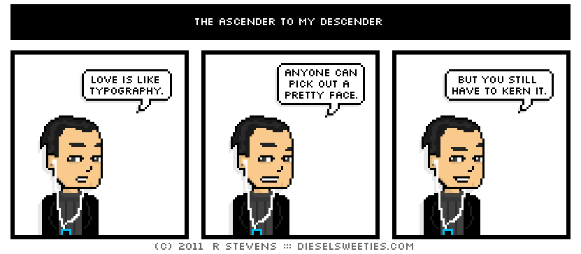
OK, when you put it like that it makes more sense to me. Thank you, Diesel Sweeties.
[Note: This comedic use of simile is relevant to my interests, but only in the abstract. Oh, how I wish it had specific relevance, but I’m trying to make peace with my fate as a lonely spinster.]
I’ve just come back from an incredible two-week trip to India — a whirlwind tour with stops in Bombay, Ahmedabad, Boroda, Calcutta, Serampore, and Bangalore — and there’s a lot of material to sift through, a lot of new ideas to work on, and a lot of thank-yous to write. Seriously, this past weeks could easily be the start of months of activity if I were able to spin all these threads into other things.
A lot of that will have to wait, however, because I also found out that my UK sponsorship came through, and I suddenly have to jump though all the hoops necessary to move back to England in about three weeks. THREE WEEKS! That’s great, yes, but also a little overwhelming.

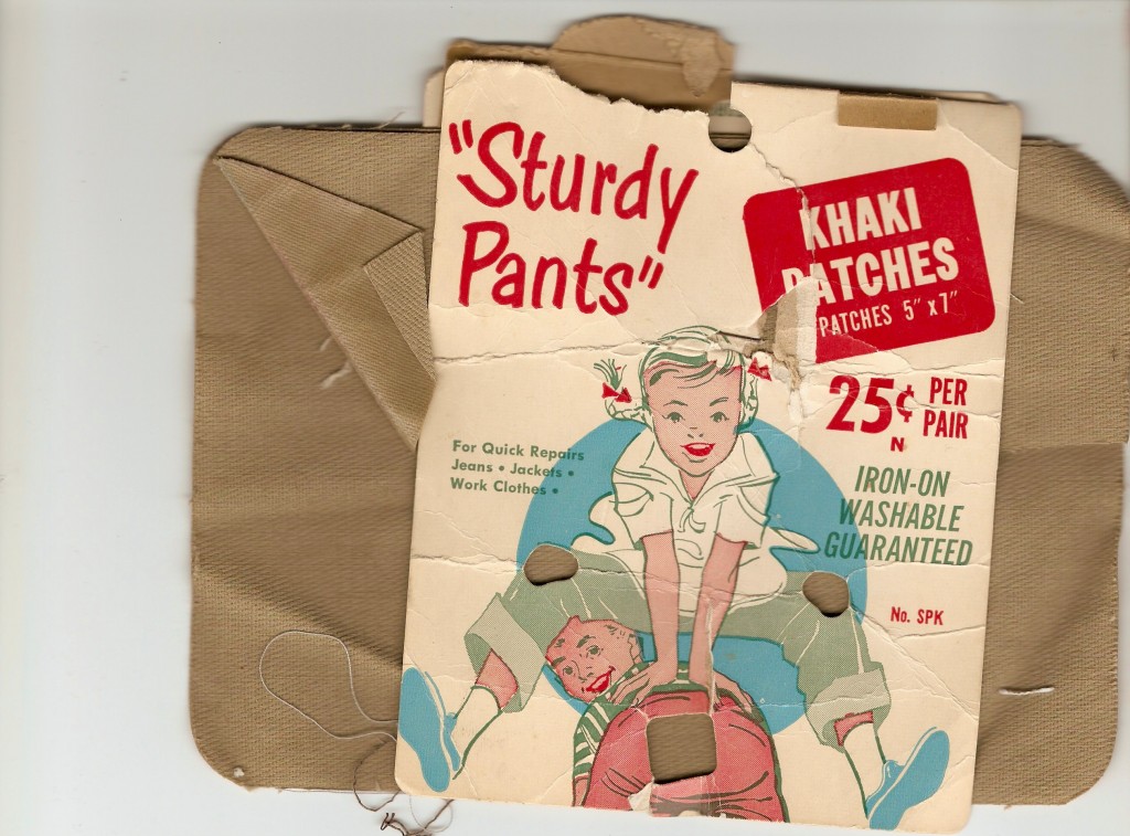
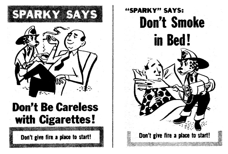
Irreverence You Can Almost Touch -“The most disposable yet fascinating of all magazines are the small do-it-yourself, photocopied or offset-printed fanzines. Before Web sites and blogs, these zines were a bridge between mainstream magazines and personal newsletters. Well, maybe not a bridge per se, but an alternative to slicks, one that could be produced with minimal cost and by virtually anyone with a mind to publish. Spiritually related to Dadaist and Surrealist art journals of the 1920s, yet born of the ’60s underground press, these limited-run, nonprofessionally produced zines, when seen in light of today’s digital culture, were, and in some cases still are, the last stop on the road to print’s predicted extinction”