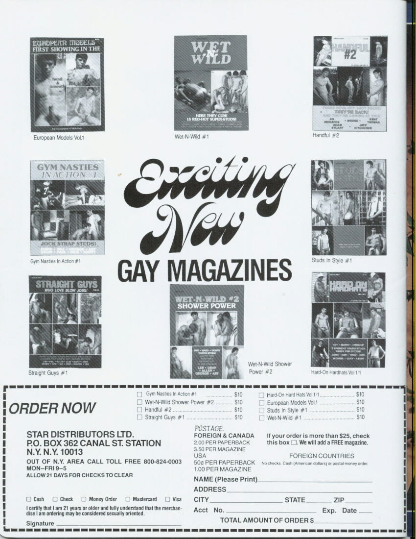
I’m this much.
Ragtag grab-bag

I’m this much.
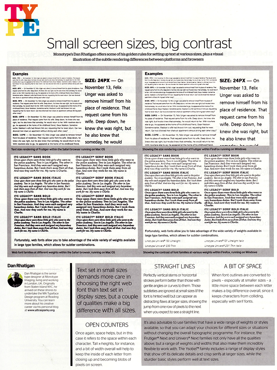
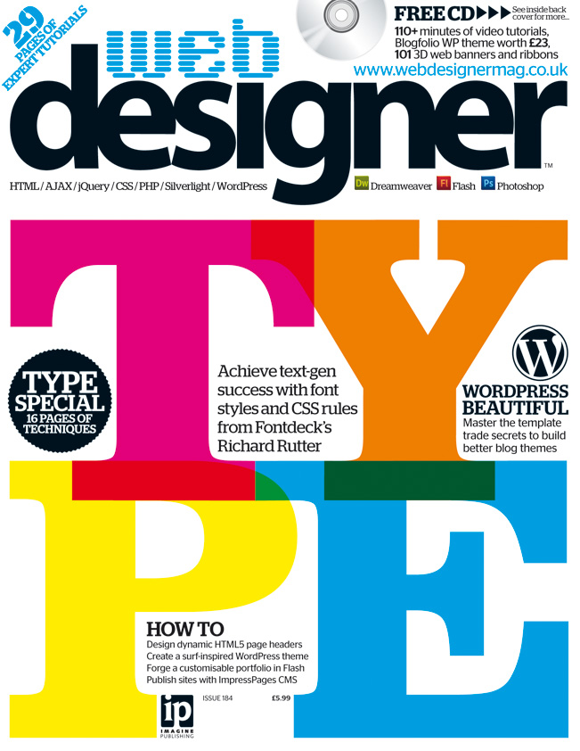 Just a quick one for the clippings file: I wrote up a few quick tips about choosing typefaces for the web (or any screen-based project, really). Nothing major, but some ideas to chew on. This is from the web typography special issue Web Designer magazine (no. 184).
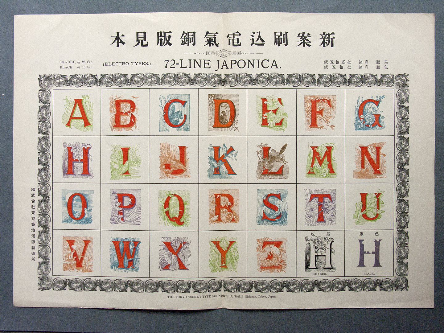
Chromatic initials caps from the Tokyo Tsukiji Type Foundry, photographed at the St. Bride Library.
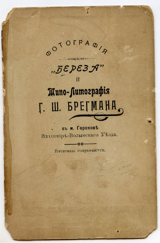
Just earlier this evening I was talking about how I really ought to do some serious research into Cyrillic typography soon, and get a handle on the range of options for different styles of Cyrillic typefaces. And then this little beauty shows up, like a Post-It note for me.
Back.
In my official capacity, I wrote an opinion column for the latest issue (no. 192) of Computer Arts magazine about the state of digital type. I’m not sure if the article will be posted to their website, so just to be safe I’ll include it here:
I’m traveling in type-nerd style now. Well, I’m sure it just falls back to full-on nerdiness in my case. Nevertheless, I’ve been a little obsessed with this since I saw it a few months ago, so I finally gave in and treated myself.
So nerdy.
Journalism is frustrating, because it has a way of making its errors become part of the public record, and then they take on a life of their own. So pardon my pedantry, but I want to clear up a couple of nerdy type things.
This article from The Daily, written by Katherine Eastland, talks about the murky history of the origins of Times New Roman, which may or may not have been the brainchild of Stanley Morison (the accepted version) or William Starling Burgess (a competing theory that arose in the late 80s). There’s ongoing debate about the Morison/Burgess divide, and I’ll admit that I tend to side with the more fully documented (both in general, and in agreement with what little I can find within Monotype to support it) notion that Times New Roman was based on Plantin, as art-directed by Morison and drawn by Victor Lardent and various people within the Monotype drawing office. I won’t rule out the possibility that Starling Burgess drew up the concept first, but Occam’s razor makes me doubt it.
However, there are a few outright factual errors in the article that have already been replicated in a BoingBoing post, and that’s annoying.
Most of the trouble is in this paragraph:
“The original story of Times New Roman’s genesis goes like this: Morison wrote a blistering article in 1929 arguing that Times Old Roman, the font of The Times of London, was dated, clunky, badly printed and in need of help — his help. The paper listened and charged Morison with directing the creation of a new suite of letters. He did, and on Oct. 3, 1943, Times New Roman debuted on the bright white broadsheets of the London daily.
I’ve come across “Times Old Roman” before, and I always thought it was just a lazy response to the puzzle of what the “new” was in Times New Roman. (It was simply the new roman for The Times, in fact.) While I was checking my facts to rant about this, though, it dawned on me that Monotype is responsible for the confusion because of this image illustrating the cover of that 1932 issue of The Monotype Recorder:
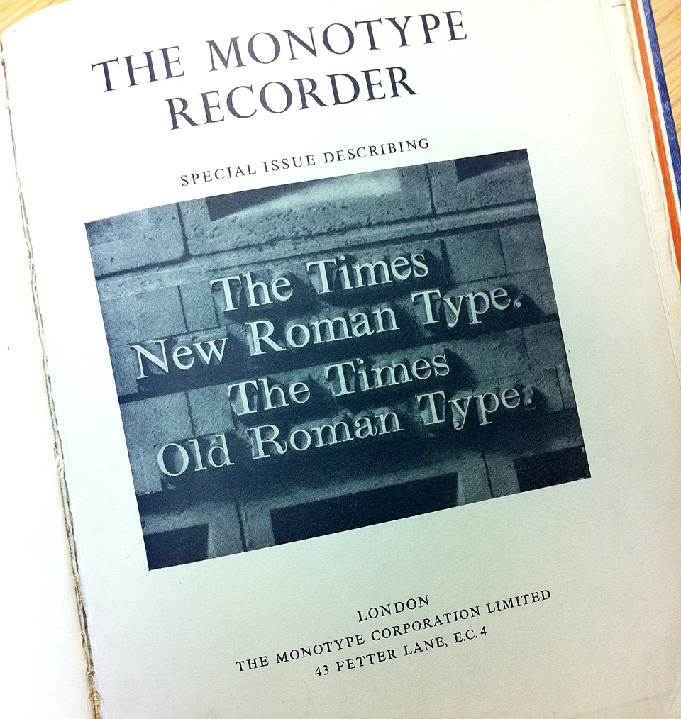
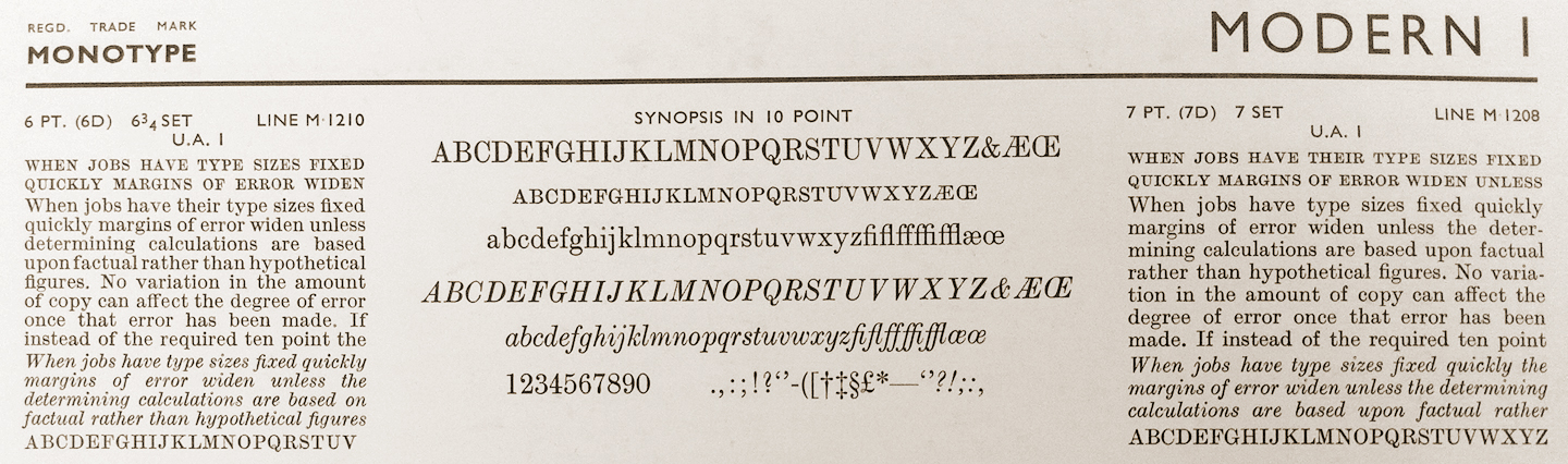
That’s a photograph of two Monotype faces: Times New Roman and Series no. 1, Modern. That’s all. It says “The Times Old Roman Type” because it’s an illustration of the old roman type used by The Times, which was Modern, an old design that was no longer all that modern:
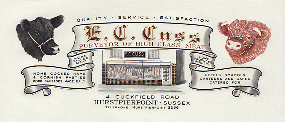
Isn’t this an exquisite letterhead? Modernism had its place, but I really do miss the craftsmanship and exuberance of things like this.
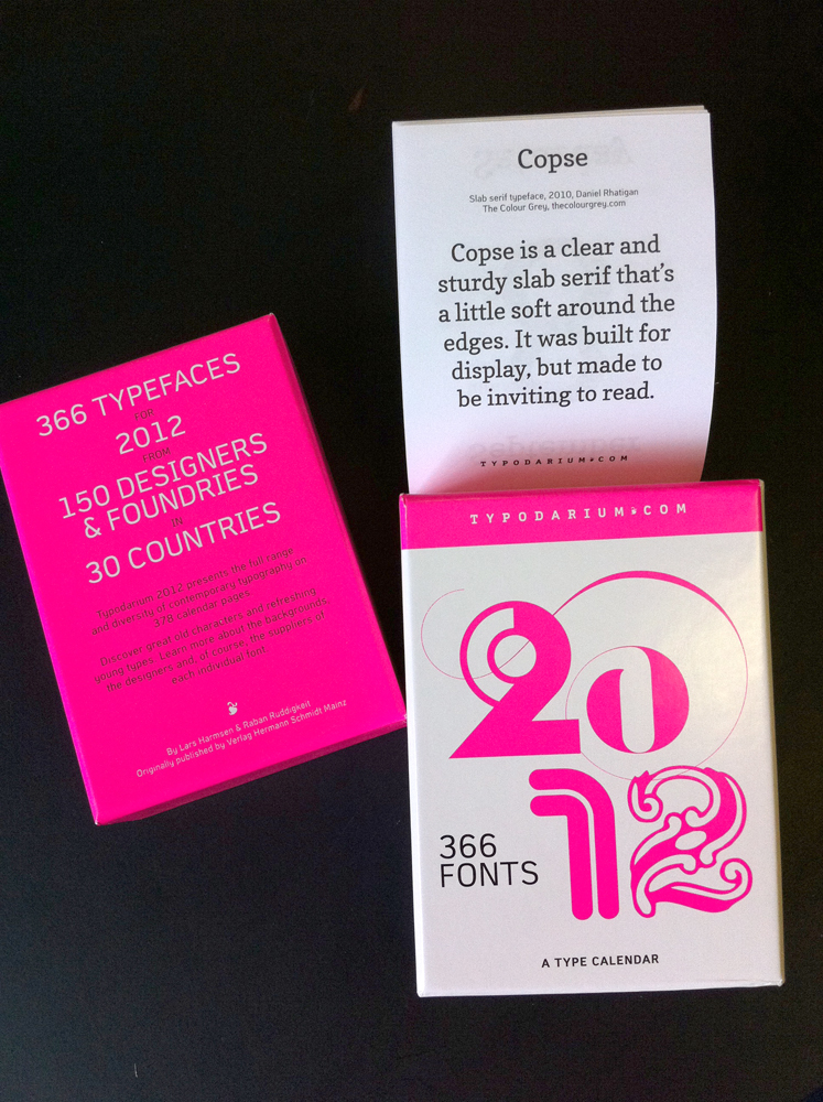
I contributed to the Typodarium 2012 calendar with Copse and Astloch.