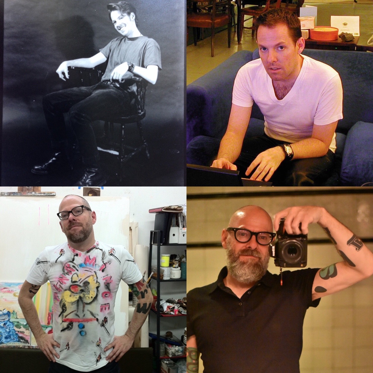
I have a face for radio

Paper Cuts

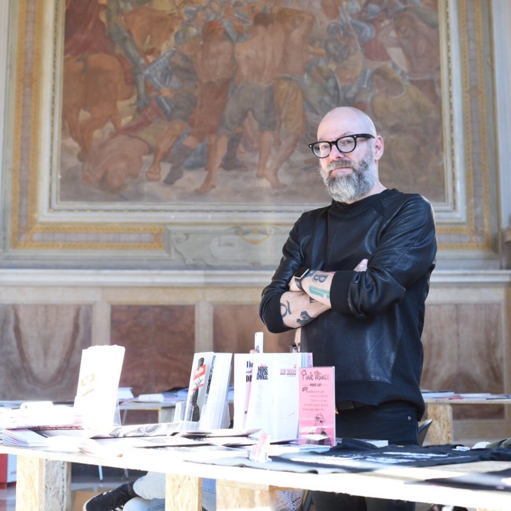
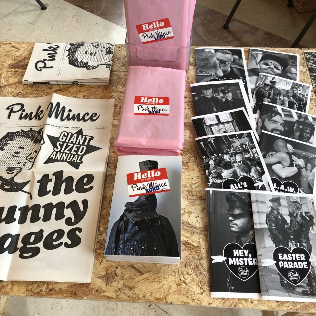
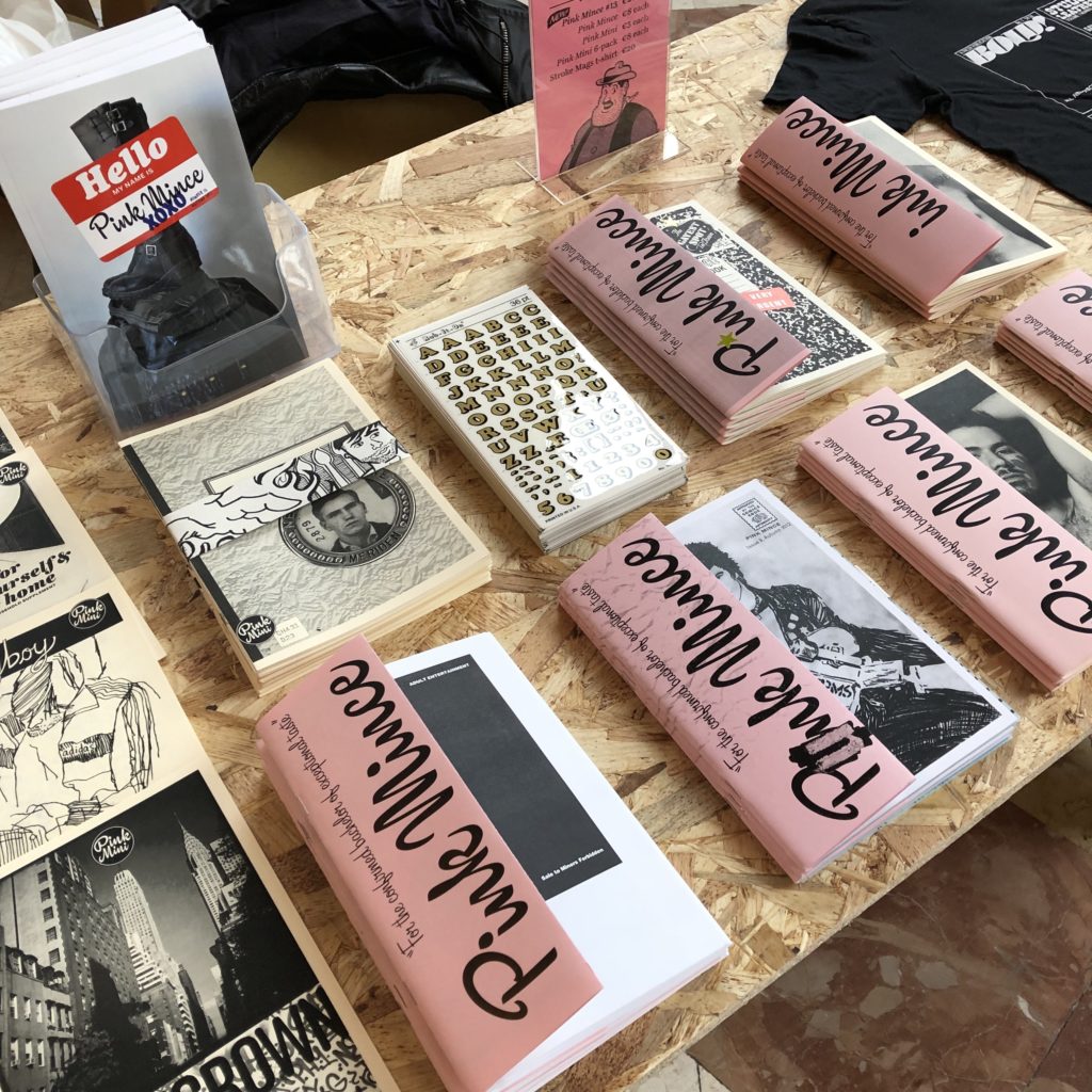
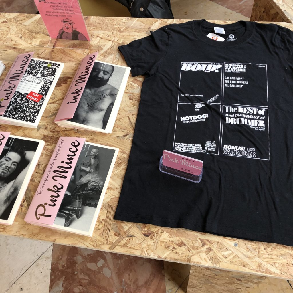
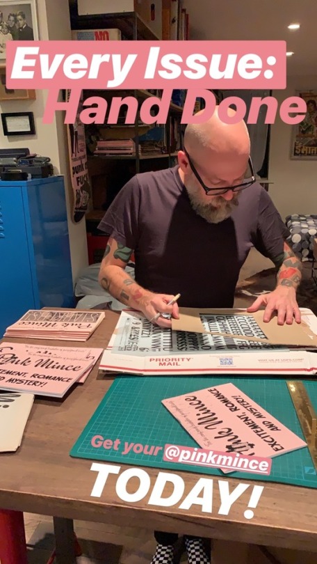
Like this site, Pink Mince is another side project that’s been going for so long that its own history is part of why I can’t bring myself to call it quits. I may publish sporadically, but I’m really proud of the eleven issues (not to mention the Minis, the merch, and the far-more-active Tumblr moodboard) I’ve produced across the last 6 years or so.

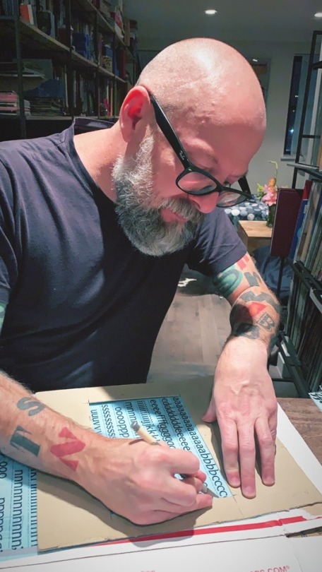
Despite the body of work, it’s rare for a zine get much of a reach, so I don’t often get to talk much about what the overall project has been about over the years. Happily, book artist Christopher Kardambikis invited me for an interview on Paper Cuts, an online radio show he hosts, where he talks to zine makers and other DIY publishers about the things they do. It was great to ramble on for a bit, and finally explain what I mean when I say that Pink Mince isn’t just a gay zine, but is also a showcase for contemporary typeface design and vintage lettering that features pictures of dudes.

Sparky in Vienna

(That’s me sneaking a discussion of Pink Mince into a talk on Letraset I was giving in Vienna.)

A Brief History of Typography 1928 – 1980

Note: for the sake of posterity, and because I’ve been blogging long enough to know that online stories tend to go missing after a while, I’ve started trying to repost articles in which I’m included. This lovely post by Ellen Shapiro, who came to see us at Pencil to Pixel, originally appeared on Print magazine’s site.

At Monotype’s “Pencil to Pixel” pop-up exhibition in New York City last month, 3,400 students and professions learned about the history of typography. Artifacts demonstrated how metal type was historically designed, made, specified by designers, and set by typesetting companies — and translated into today’s font menus for individual users.

“The lesson from an exhibition like this is that the design of a typeface can outlast the moment that produces it, and that a good design can evolve to meet the needs of technology without losing its essential spirit,” said Dan Rhatigan, Monotype’s UK type director. “Lots of younger designers who came through seemed really eager to see the background of the typefaces they already know, and the exhibit helped them appreciate why we’re still trying to improve the technology behind those designs,” he added.

Here are close-ups of some of the artifacts that were on display as well as some typography history:

1928 — Eric Gill’s pencil and ink drawings for Gill Sans, the fifth best-selling typeface of the twentieth century. Gill (1882-1940), a British sculptor, stonecarver, printmaker and typeface designer, designed Gill Sans in 1926-1928 for Monotype at the request of Stanley Morison, who was interested in a contemporary sans serif face with British character. Classified a “humanist” sans-serif face intended to be legible in both display and text, its proportions were based on Roman letterforms rather than being constructed geometrically. Famed uses of Gill Sans include programs for British Rail, the London Underground, Penguin Books, Saab Automobile, and the BBC. Note the use of white gouache paint to touch up the letterforms.

1937—Copper patterns for Eric Gill’s Joanna. Copper pattern plates were utilized in the manufacturing stage between the drawings and the metal type itself. A transitional serif typeface named for one of Gill’s daughters, Joanna was designed in 1930 and originally intended as a proprietary face for his printing business, Hague and Gill, opened in Buckhamshire, outside London, with son-in-law René Hague. It was adapted by Monotype in 1937 and made publicly available in 1958. Gill set the text of An Essay on Typography, his classic book on letterforms, typesetting and page design, in Joanna. In the book, he demonstrated and championed the first use of “rag right” rather than justified columns to create even letter- and word spacing.


1939—“Big Red,” a comprehensive specimen book of Linotype faces. Published by Mergenthaler Linotype Company, this classic reference tool measures 7.75″ x 10.75″ and contains 1,215 pages of type specimens for hand-set headlines and text set on linotype machines, including model ads and announcements with lavish use of dingbats, ornaments and borders.


1932—Littleworth. These rare, original letter drawings are in the Monotype archive for Littleworth, a hot-metal typeface no longer available,

1971—Classic linotype faces were remastered for photo-typesetting. These brochures announced Monotype newly released versions of Helvetica and Univers for use on the first photo-typesetting machines.


1980—The ITC Typeface Collection, a specimen book of the library of the International Typeface Corporation. This 574-page, 12 x 12” square book is a compendium of the individual “26 Good Reasons to Use” booklets originally designed by Herb Lubalin and released by ITC throughout the 1970s. It was published to interest manufacturers of typographic equipment and materials in licensing the ITC typeface library, which included American Typewriter, Avant Garde Gothic, ITC Benguiat, ITC Bookman, ITC Century, ITC Franklin Gothic, ITC Garamond, Korinna, Lubalin Graph, Serif Gothic, Souvenir, and Zapf Dingbats. In addition to Herb Lubalin, type designers included Ed Benguiat, Tom Carnase, Tony DiSpigna, Aldo Novarese and Herman Zapf.

The book concludes with a copyfitting chart, essential to all designers, part of whose job was to mathematically convert typewritten manuscripts into set type by calculating the size and leading to fit on the page.

In 1980, ITC subscribers included Cello-Tak, Chartpak, Letraset and Zipatone, manufacturers of rub-down lettering, in addition to Alphatype, Berthold, Compugraphic, Monotype, and other purveyors of photo-typesetting equipment. Agfa Monotype acquired ITC in 2000.

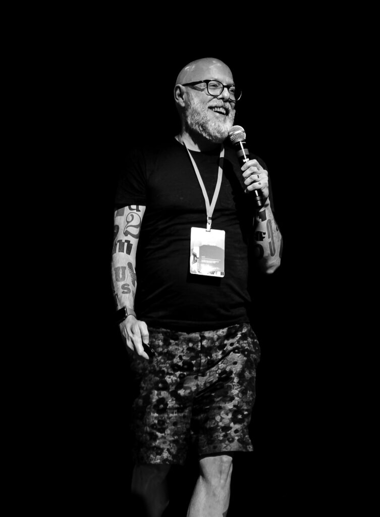
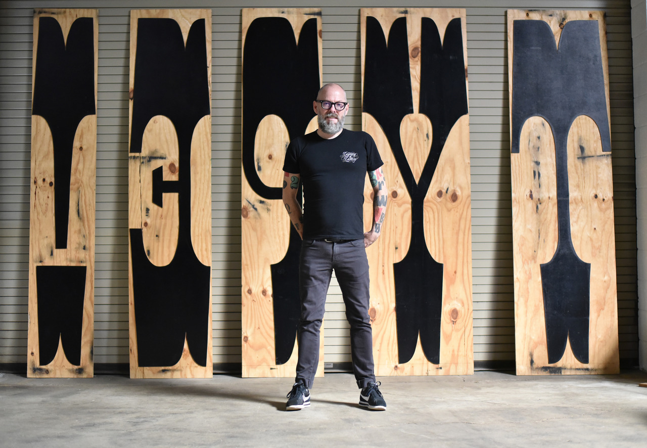
2013—the typographic body art of Dan Rhatigan, Monotype’s UK-based type director. This was the “display” in the exhibit I was most curious about (even though he was standing next to a display of covers and spreads of U&lc, a few of which I’d had a hand in).

“My tattoos are always a point of interest with type crowds,” said Rhatigan, who said he got his first tattoo, the swashy ‘R’ of an ersatz family crest he designed, in 1998. “After staring at that ‘R’ for months, I realized that my love of type is timeless. So I started adding shapes I loved from different typefaces, working with different tattoo artists who appreciate the idea enough to carefully reproduce the artwork I supply.”

Rhatigan’s friend Indra Kupferschmid put together a custom MyFonts list of most of the typefaces that are tattooed on him. There are a few others, too, he added (some of which apparently can’t be shown in polite company), including letters from Delittle Wood Type foundry; from H&FJ’s Champion Gothic; and from Sodachrome, designed by Rhatigan and Ian Moore for House Industry’s Photo-Lettering collection.

Pencilled, Pixelated

Since I started working full-time at Monotype, and especially since I took over as UK Type Director last Spring, work has consumed a larger and larger part of my life. This would be bad if I didn’t love this job more than any other I’ve ever had, and if I didn’t feel like I was contributing to what happens at Monotype. My attempts to keep up with this site, always a tricky endeavor at the best of times, may have fallen slack, but I’ve hardly been slacking off elsewhere.

Monotype. One of a kind. (Photo by http://twitter.com/desypha)

The last two weeks have been the culmination of a frantic couple of months of preparation for a giant exhibition of work from Monotype’s past and its present, and hopefully a look at its future. Pencil to Pixel, masterminded by my extraordinarily talented colleague James Fooks-Bale, designed by SEA, partially curated (and with guided tours) by me, and pulled off thanks to the efforts of many more, was huge success by all measures, and hopefully one of many more endeavors to come.

Continue reading “Pencilled, Pixelated”

Avant Garde

Avant Garde

I spent the day working on a custom version of this typeface, thinking that it’s one of those designs that only seems to deserve its fame when it’s used just right, but the rest of the time feels a bit off. I don’t love it, but I have a deep affection for it. Avant Garde was, after all, the typeface that turned me into a typographer.

Kroy 80 Supplies and Specimens-coverKroy 80 Supplies and Specimens

When I was a pimply 14-year-old freshman in high school who still just wanted to draw comics for a living, I joined the staff of the school newspaper hoping to contribute a bit of art now and then. One of the first things I was taught was the use of the Kroy machine, which set type on transparent strips of adhesive tape for the headlines in the paper. Among the font discs we had on hand was Avant Garde Demi, and it included a number of the alternate glyphs that actually make this design interesting. Playing with that font and that machine was the first time I thought about the visual possibilities of a certain style of letter, and how you could create something by manipulating how you arranged letters. It wasn’t an immediate conversation, but something clicked, connected to my fascination with comic book titles and sound effect balloons, and — obviously — eventually led to a lifelong fixation.

Avant Garde Sparky

[Letraset photo via alexvmsf]

Official business

April Fool’s Day is probably a bad time to make a major announcement, but I swear this one is for real. As of today, I am employed full-time as a senior type designer at Monotype Imaging, based out of our office in Salfords, a bit south of London. (I live and spend most of the time working in London itself, however.) I will probably spend most of my time for the next few months continuing to work on Indic typefaces, and doing a bit more speaking about type design and typography. And actually getting paid for it. Is that awesome or what?

Hooray! Did you know that I’ve spent the last few months whining about my work visa issues, and living back in New York while I waited for all this to fall into place? After working for two years on a collaborative project between Monotype and the University of Reading, and then waiting for the visa stuff to get sorted, I feel like I have finally completed the longest job interview of my life. I am relieved, and excited.

Sparky typefaces

[Note: This is as good a time as any to point out that this is my personal web site, though, where I generally speak off the cuff, and occasionally talk some shit. Those opinions are mine, not the company’s. Obviously.]

Oh Coney, My Coney

The start of Summer always makes me long for Coney Island, especially now that it’s so far away and I’ll probably never see it again before it finally gives in to all the pressure and becomes something else.

Wonder Wheel

But there’s so much to love. If you haven’t been there it may be hard to see past the decay and appreciate the real charm that comes from the liveliness of the place, and the visible signs of a long, colorful history. I’ve always had trouble putting my finger on my love for the place, although it’s such a goldmine of lettering and kitsch that it’s easy to understand what first sucked me in. But it’s always been more, somehow, too.

Coney Island Dream from Joshua Brown on Vimeo.

[Coney Island Dream from Joshua Brown on Vimeo.]

Shoot the Freak