Do you like the idea of using crazy characters in your blog posts or online profile headlines, but just can’t remember all those nutty character entities? Fret no more! This website is a tiny little thing that lets you copy and paste to your heart’s content. Of course, after all the time I’ve spent dealing with Unicode charts, I actually think they could have been a little more ambitious. How useful is it to include the interrobang (‽) but not mu/micro (μ) or the eth (ð)? We love the eth!
Category: ultranerdy
Gays of Future Past
This is a long clip, but it’s truly sublime, a testament to verbal flair of one of the greatest confirmed bachelors to ever venture forth into outer space: Dr Zachary Smith!
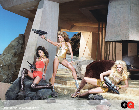
Battlestar Barbarella
When worlds collide, eh? I love both Barbarella and Battlestar Galactica, but for very, very different reasons. Seeing them mashed together for a promo shoot makes my head hurt a teeny bit. If I were more of a straight persuasion, though, this would make me all tingly, though.
Of course, Apollo or Helo done up as Pygar would certainly do the trick.
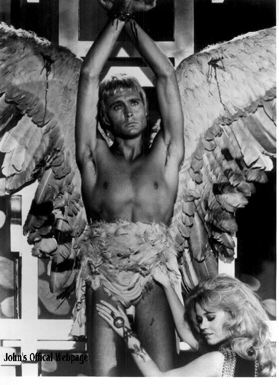
Barbarella — The Bob Crewe Generation
Pygar’s New Wings — The Bob Crewe Generation
Assorted Bits of Nerdistry
Bullet time!
-
I had a maddening problem with my iMac on Saturday that I was only able to resolve by wiping the drive and restoring it from the backup. Overall I was impressed with how Time Machine came through for me, and luckily someone else wrote a nice wrap-up the the process so I don’t have to bother. (My two cents: I still wish Time Machine could make a bootable backup.)
-
I was glad to see that Microsoft Office 2008 was finally making the ClearType fonts available to Mac users. I dropped into the Apple store yesterday to have a look, and saw that even though Word is using Cambria as the default font, it’s wasting a huge chunk of what Cambria can do. Unfortunately, the Mac version isn’t using the spiffy math engine used by the Windows version — it’s still using the clunky old Equation Editor that defaults to Times New Roman. I can’t say that I love Cambria very much, but after all that research I did about what it can do as math font, it’s a shame to see that potential wasted for Mac users.
-
I went to go see the Breaking the Rules exhibition at the British Library yesterday, and realized how badly spoiled I’ve gotten after my time at Reading. We get to spend so much time examining books and stuff up close, using our own hands, that it’s incredibly unsatisfying to look at printer material under glass now, no matter how exciting the exhibition may be. Books are especially frustrating to see from the other side of a glass case, since you lose the whole sense of rhythm from page to page, and you can’t inspect the little details of how the ink sits on the page.
Busted
Friends, don’t let this happen to you: “Publisher in £80,000 font raid”
A publishing firm fell foul of the law by using unlicensed typefaces worth £80,000, according to licensing lobby group the Business Software Alliance (BSA).
The publishing firm had claimed to be using just one font but in fact was found using 11,000.
There is, naturally, a maddening Slashdot discussion about this where all kinds of justifications for piracy are tossed around, but it think it comes down to a few key points for me (and I freely admit my personal bias when it comes to people doing the right thing and paying for software and typefaces):
- That piracy is illegal, yo, even if you think the stuff should be free.
- And if you’re making money using your pirated wares? Tsk, tsk — suck it up, and take the tax deduction as a consolation prize.
- Your piracy is part of the reason software is so damn expensive, anyway, so quit making it harder for the rest of us to do the right thing.
- Also, people are trying to earn their livelihood by making that stuff (and I will probably be one of them soon), in case your moral reasoning requires a human face to make you realize it’s theft.
Now, I know it’s hard. I was, in the days of my youth, an unspeakably shameless software and font pirate. But I found it to be very ethically murky territory after a while, not to mention the whole “illegal” thing. I now own valid licenses for the software I use, but it’s still challenging to restrict type usage to the ones I’ve actually paid for. (And that’s coming from someone who has spent a small fortune on properly licensed typefaces.) I pay for all the type I use for freelance projects (since if my business is making with them, then the foundry should get their fair share), and I’ve been weening myself off the illegal copies, slowly but surely.
It’s hard, because even though there are lots of free fonts out there, most of them are shockingly craptacular. Others are sketchy copies of other fonts, which is still bad form, even if the legality technically toes the line. (The short version: you can’t copyright type designs in the U.S., but individual fonts are software, which can be copyrighted.) There are some decent options out there, such as some of the ones found on here, but even with those the usage is often limited to stuff where you’re not making money off of someone else’s hard work.
So be a good sport and buy a typeface today. Someone, somewhere could probably use the royalty check.
Type Geeks
Just about all my waking hours for the last few days have been spent in the midst of fellow typography nerds at Typecon, where we all get to let our freak flags fly and rant about the differences between the 7 different versions of Garamond (including Sabon, the pseudo-Garamond) without getting crazy looks. Sadly, I had to pass up a few cool type-drawing workshops because work duties overlapped with the conference more than I was expecting. I also had to miss a walking tour of some classic NYC signage, which was especially disappointing since the Times pointed out that one of the stops was my old high school, where apparently, “The ‘R’ is too small in the bowl, and too long in the leg.”
As tired as I am (since all the sleeping hours were spent trying to fend off the summer combo of cold/allergy attack), I have to hustle back there this morning looking as cute as possible, since my colleague Ina Saltz is giving a talk about typographic tattoos that will include some pictures of my work. If Erik Spiekermann finds me to yell about the why I altered the position of the dots in my Meta Bold umlaut, I want to at least look presentable.
Aw, who am I kidding? I want to look cute for all the cute type geeks who’ll come up and admire my arms afterward.
For Frack’s Sake
I was totally jazzed about the new Battlestar Galactica when it was first aired, but I didn’t trust my reaction completely. I mean, I didn’t have any complaints about it but it was so new and so full of eye candy that I wasn’t yet sure if I was just caught up in the frenzy. I’m watching the repeats now, though, in preparation of the beginning of the new series, and I stand by my initial reaction. This really pulled off what I was hoping for: a solid update of the original premise and the original art direction, but without all the 70s network-television cheesiness that ruined the first version so completely.
This is a dark gritty future (or past? present?) that’s different but not utterly alien. I love that they really thought about the split between the human society and the Cylon: humans lost their faith in technology, but can’t escape their dependence on it, while the Cylons seem to be looking for some kind of humanity in themselves. The characters are much better written this time, from the major players down to the pretty large supporting cast. (Also, most of them are smokin’ hot, which is a nice perk.) Some of my favorite bits are:
- All the nods to the original set and prop designs by having them shown as museum pieces of an old human/Cylon conflict. that’s just pure candy thrown to the fanboys, and I appreciate it.
- Automated Cylon ships, which make more sense than the old ones with their three-robot crew. Sadly, the old ships still look much better.
- Liberal use of old-fashioned tech. It makes sense in the story, but it’s also cooler looking than goofy, shiny stuff everywhere.
- Fantastic flight choreography. More than any other sci-fi I’ve seen, this really shows space as a three-dimensional void without a clear plane of orientation. Such a simple guiding principle, but one that’s never really considered by most other sci-fi movies or shows.
- Armaments instead of lasers. It’s just a nice change of pace that makes for more interesting visual effects.
Of course, now the nail-biting begins as they head into the murky territory of pulling off similar feats on a weekly basis, and within a the budget of a weekly show. Horrible things may still happen to ruin the effect of strong start like this. Let’s just hope it hangs on long enough for a few shameless scenes of shirtless fighter pilots.
#928
This is my 928th blog entry (more or less there have been a number of guest writers, and I’ve deleted a few irrelevant technical announcements from former sites), having now combined into this one place all the posts ever made from all the blogs I’ve maintained for the last three-and-a-half years.
Phew!
I had to do a quite a bit of manual editing of all the stuff I wrote before I used Greymatter, which turned out to be more of a stroll down Memory Lane than a hassle. It was amazing to see how much has changed in my life over all that time. I started proper blogging a while after the dissolution of my last serious relationship and starting over again in my own place in East Williamsburg a time when I was still depressed, angry, tense, and eager to focus on something other than the difficulty of the previous few months. I wanted to sharpen my writing skills and put something in place that would make it easier for me to add new content to the website I’d been maintaining for a while. I wanted to tinker with some new tools that had just come out.
Since then, my weblogs have collected the records of my adventures, successes, my goofs, my failures, my insights, my cluelessness, and my changing attitudes. Crushes and boyfriends and friends have come and gone, some quite publicly and some with only the most obscure references. I’ve moved a few times, started and quit jobs a few times, gotten depressed and crawled back out of it, and grappled with the same damn insecurities over and over and over again. There have been a number of earth-shattering changes, too.
For all that’s happened and all that I’ve changed, I don’t really think that I’ve grappled with any more or less than anyone else. Whose life doesn’t go topsy-turvy once or twice between the ages of 28 and 32? Or during any other four-yean span, for that matter? It’s just weird to go and sift through all of that, and think about how publicly it all transpired (and also ponder the various gaps in the story, events and people I chose never to expose for one reason or another).
I’ve been thinking about how much energy has gone into all this writing over the years, and it made me stop kicking myself quite so hard for feeling like I never accomplish that much. Granted, it might have been nicer if I’d been paying attention to the effort that was underway so that I could have focused it and written an actual book or something, but I guess all the material is still here in case anyone makes me an offer.
All that stuff was also a good reminder about how my energy and my ability to articulate things ebbs and flows. Lately I’ve felt like I’ve barely been able to string two coherent words together. I’ve been almost completely incapable writing decent, thoughtful posts or e-mails, which has led to an enormous pile-up of overdue letters to people who’ve probably been offended by my silence. (It’s not for any lack of care, I swear, and I’m trying to catch up, just so you know.) I’ll get back in the saddle agian at some point I always seem to eventually. Life is a journey, right?
And thanks to everyone who had read this site, written for this site, or left any of the 2200 or so comments that have been collected (there would be more, but the demise of BlogVoices taught me my lesson about third-party comment services). Y’all are a huge reason this has all been worthwhile, and will hopefully continue to be a big part of life for years to come.
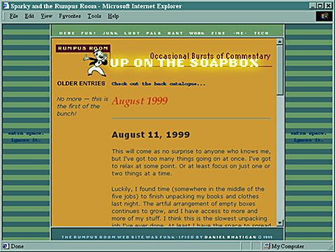 |
So what did your site look like when you first started out?
Unimaginable Hunger
I was getting ready to write all about how deeply engossed I became in Manor House this weekend, and what a fascinating experiment it was and how I think public television’s reality shows are in some ways more sinister than their commercial-televison counterparts and how I can’t shake the sound of Kenny the hall boy saying “She’s a right cracking bird” and stuff like that, but then I got completely distracted by this very funny, nerdy spoof: A Blog for Galactus, the devourer of worlds. Hee hee!
I still wanna write more about Manor House, though, and what a fascinating look it was at class relations that never quite existed the same way here in the United States. The closest equivalent we might have, which would be much more controversial television, would be Plantation House.
Top Ten Treats
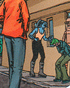
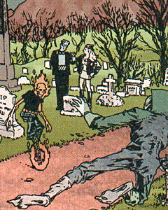
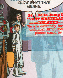
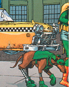
I’m a sucker for work that slyly works in the pop culture heritage that I’ve absorbed throughout my life. There’s a lot of heavy-handed, ironic name-dropping of old TV shows and such out there, but that shit’s just weak. What I’m talking about is stuff that has its own story to tell, its own point to make, but shows a certain amount of playful reverence for its direct or indirect source material.
Writer Alan Moore has always been a particular favorite of mine for just this reason. When I first read The Watchmen years ago, it was like a boot to the head to encounter this mature look at the culture of superheroes that drew on the conceits of the genre I knew and examined them in a new light. It was critical and thoughtful and even playful, but most of all it showed a deep love of comics and comic-book culture.
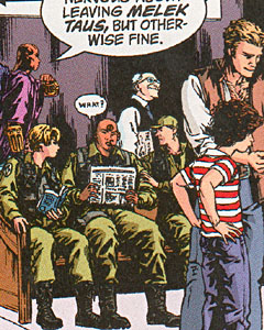
Years later, his series Top Ten gave me another wallop. It wasn’t trying to reinvent the medium in quite the same way, but instead it created another world altogether, one based on the idea of a city where generations of costumed crimefighters lived and bred and thrived and crowded the place. It was a fun idea, and a fun story, and I loved it. It was a slower read than most comics, though, because Moore and the series’ co-creator Gene Ha packed every panel with so much detail of life in the city of Neopolis that every scene had to be analyzed. They populated the place with new characters, generic supertypes, and all matter of characters from decades worth of comics, movies, and TV, often recolored or recombined in any manner of subtle in-jokes for the nerd crowd. Bliss.
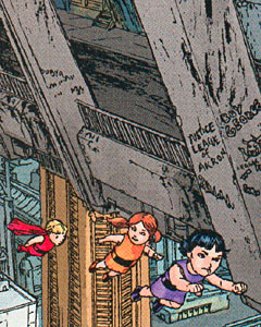
I loved it, but I’d forgotten about what a fun read it was until I grabbed the second volume yesterday and found myself giggling uncontrollably as I digested the artwork again. Here are a few blown-up details. How many characters can you identify?
 |
 |
 |
 |
 |
 |

