Metatextual Comics

I’ve pared my regular comics selection down to the bare minimum for the time being, so any time I buy a few books they’re always something I love. There were a few especially brilliant bits in this week’s assortment.

The first one is from the comic tie-in to a movie based on a comic, Justice League: The New Frontier. Observe as Rip Hunter — Time Master! — takes a swipe at continuity nerds (click to enlarge):

Rip Hunter, metafictioneer

Next, some literary commentary on Hamlet from Jack of Fables:

The Faeries
The Faeries

Leave it to the viking to cut to the chase.

Up, Up, and Away

Superman, v1.0It’s a tricky thing, this whole appreciation of superheroes and comic books and such. Part of what seems so nerdy and embarrassing about it is how often people — even others who love the capes and the four-color reality — seem to get it wrong, how often they fail to grasp that we each love different things about the genre. No, not just this particular fictional genre — the whole idea of superheroes and comics.

I can’t blame people for not getting it, because a love of comics is just so personal. They’ve been part of our culture for so long now, pushed and pulled and reinvented in so many ways that they can be something different to everyone. Every fan of comics loves them for a personal reason, and is convinced that a naysayer just has to read the right comic that will resonate and change his attitude forever. But not even all lovers of comics appreciate them the same way. Venture if you dare into any discussion forum about comics and you’ll see what I mean. Some folks love the escapism, some folks love the intersection with or reflection of reality. Some folks are obsessed with details and continuity, and some with the core of any legend. Different strokes, y’ know?

And it’s hard to begrudge anyone who doesn’t get into comics, because even though he — or shockingly enough, she — might just need to read the right one, the fact is that there’s so much crap out there it’s easy to say they’re not worth any attention. And when the world of comics strays into other media — novels, TV shows, movies — the magic and myth usually just fall apart.

Usually, I say. Michael Chabon’s The Amazing Adventures of Kavalier & Clay is one of the most breathtaking looks at superheroes and comics I’ve ever read. It takes the whole world of comics and wraps up the mythology and the excitement and the context in a delicious little package. When I read it, I was stunned that he cut through all the bullshit and the cliches and the cultural baggage around superheroics and put his finger on the wonder of it all, and the way drams of men and women in tights can speak to kids and adults alike. Sometimes in different ways, sometimes in the same ways.

There’s a certain sense of wonderment and wish-fulfilment at the heart of my love of superheroes. It has endured, even as my world has expanded to other passions as I’ve grown up, and even as my taste in comics has slowly spread out to non-superhero comics. Again, Chabon shows that he gets it at the most basic level in Secret Skin, a lyrical, insightful essay for the New Yorker about the whole problem of men in tights. He gets down to the core of it all, the basic idea and how it defies practical reality because it’s not about reality. It’s about something other than reality, and perhaps closer to it than anything else:

We say “secret identity,” and adopt a series of cloaking strategies to preserve it, but what we are actually trying to conceal is a narrative: not who we are but the story of how we got that way — and, by implication, of all that we lacked, and all that we were not, before the spider bit us. Yet our costume conceals nothing, reveals everything: it is our secret skin, exposed and exposing us for all the world to see. Superheroism is a kind of transvestism; our superdrag serves at once to obscure the exterior self that no longer defines us while betraying, with half-unconscious panache, the truth of the story we carry in our hearts, the story of our transformation, of our story’s recommencement, of our rebirth into the world of adventure, of story itself.

Oh, hell yes.

Royal Occidental Tuna Fisheries, Ltd.

I’m not much of a cat lover (though heaven knows I’ve tried to warm up to a few in the past), which is part of the reason the whole lolcats phenomenon leaves me a bit cold. However, Adam Koford‘s brilliant cartoons of the Laugh-Out-Loud Cats takes the idea, twists it around, and throws in a few more strokes of brilliance, and the result is both adorable and devious.

All yer bass

The basic gimmick as described at the Flickr archive is:

“From 1912-1913 he [grandfather Aloysius “Gorilla” Koford] produced a comic strip which was featured in 17 newspapers, including the Philadephia Star-Democrat, the Tampa Telegraph, and the Santa Fe Good-Newser. The strip was entitled “the Laugh-Out-Loud Cats” and featured the exploits of one Meowlin Q. Kitteh (a sort of cat hobo-raconteur) and his young hapless kitten friend, Pip.”

It's a trap!

Greek Relics

A week later, and I’ve finally had a chance to unpack from my trip to Θεσσαλονίκη. (I’m procrastinating on the typeface, naturally.) I brought back some lovely souvenirs to remind me of my Greek adventure:

Greek lollipop

Candy is essential for keeping drowsiness at bay during a long conference. These weren’t the tastiest, but they have embedded Greek letters, and that’s cool.

Men's sunscreen

A pasty Irishmen like me would burst into flames if I tried to face a Mediterranean heat wave without protection. When I went to the pharmacy to grab some sunscreen, I had to wade through labels in Greek, French, and Spanish but not English. I selected a nice, strong cream, but the lady at the counter was very adamant that I buy men’s sunscreen. I tried to explain that it wasn’t a big deal, but she finally convinced me that the men’s version was better for the top of the head. (To her credit, there were no signs of pink on my bald pate after a week in the sun.) Mostly,she just seemed a little embarrassed that I might get something packaged for women.

A certain culture of assumed machismo was all over the place in Greece. I was sharing a hotel room with my flatmate Rob, like I usually do, but this is the first time I’ve ever checked into a hotel room and had the clerk automatically assume that sharing a room with another guy was proof enough that we absolutely need a room with two beds. It was the truth in this case, but it caught me off guard that it seemed so urgent to him that no female roommate meant no double bed. Luckily, we got a roomy triple all to ourselves, even if it wasn’t especially chic:

Triple at the Queen OlgaTriple at the Queen Olga

There are newsstands all over the city, and while making one of my many stops for bottled water I picked up some comic books published for the Greek market:

Greek Thing

I had to come all the way to Greece to finally find a book that dared to use upper- and lowercase lettering. See how nicely that works? I wish they’d try it in English one of these days.

Greek Batman

I especially love that even sound effects were translated into Greek. I would have assumed translations were only done using the layer with the black inks, but obviously they reprint the whole thing with the translations. That would have been a lot more expensive before the days of digital prepress.

Typovillains

Brace yourselves, gang, I’m about to geek out way beyond any geekery you’ve seen here yet. Today I’m going to meld together comic geekery and typographic geekery, and it’s not going to be pretty.

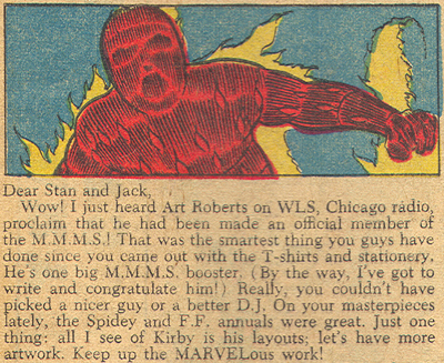
I’ve been meaning to rant for a while now about the general crappiness of the electronic lettering used in comics nowadays, which not only sucks all the charm out of traditional hand-lettering, but also leaves the lettering prey to all the mistakes of novice desktop publishers. This started when I kept noticing a simple typesetting error showing up over and over again in dialogue balloons: the use of a double hyphen instead of a proper em dash (– instead of —), a typewriter convention that spills over into amateurish handling of type. In digging up old samples to prove my point, however, I discovered that this was going on way before electronic lettering. Here’s a panel from 1966’s Fantastic Four #47:

Fantastic Four #47

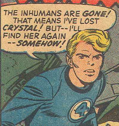
OK, so I guess this particular flub has been going on for a while, probably because traditional letterers were of a similar ilk as their modern peers: neither editors nor real typesetters, either of whom ought to notice things like that. Fine, I’ll let that slide. In the meantime, though, take a gander at the warmth and charm of that lettering. You know why it looks like handwriting? Because each instance of each letter is unique. Simple hand-lettering was cheaper and easier than typesetting, so it made sense, and the crudeness was an appropriate visual match to the artwork and the shortcomings of the reproduction. A perfect unity of tone.

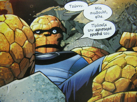
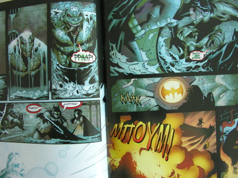
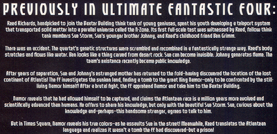
So let’s look at today’s electronic lettering, which is trying to copy the effect of old comics but getting it all wrong. I’ll let this month’s Ultimate Fantastic Four #26 be my scapegoat:

Ultimate Fantastic Four #26

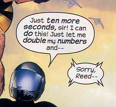
Yeah, that em dash thing. But I said I’d let that slide. Notice how every repeated letter is exactly the same? That, my friends, is why shitty handwriting fonts do not look like handwriting. They look like novelty typefaces. No variation, no warmth, no charm. It’s especially bad form when you get double letters or stacked letters. (Look at “do” and “double” up there.) It’s an affectation, but only taken halfway. Now, I’m not saying modern comics with their detailed art and magnificent reproduction quality should switch to real typefaces. If that happened legions of fanboys, myself included, would probably have massive aneurisms all at once. But since they’re not paying someone to do all that lettering by hand, couldn’t they invest in some better fonts? Some fonts that do a better job of faking the craftsmanship they’re trying to ape? That stuff doesn’t even come with decent letterspacing built in, never mind alternate characters. Gentlemen, we have the technology!

OK, but that’s not even what hurts the worst. Let’s turn our attention back to FF #47, paying a visit to the letter column this time:

Fantastic Four #47

Now, that’s not the best typesetting in the world, but it’s good for what it needs to do. A nice, wide serif typeface that can handle the cruddy printing, and some attention to details like indents, justification, and even ligatures. (Look at the “ffi” in the word “official” — that’s what real typefaces do when they’re used properly, kids.) Since they’re using real type, they’re using good type. Hallelujah!

Ultimate Fantastic Four, however — like most of its contemporaries — makes the Baby Jesus cry:

UFF #26

How to make my eyes bleed, step 1: pick a goofy, “techy” novelty font that ought to be used — and sparingly, one would hope — for titles only, and set paragraphs of text with it. Step 2: set it in white on a black background with no extra letterspacing. Step 3: make sure the line length is super-long and the line spacing is super-tight, so that it’s even harder to read easily. Step 4: center those lines, just to put the rotten cherry on top of the whole thing. Also, those horrible little em dashes that almost look like hyphens, and with no extra room around them! That is not what I want to decipher at the end of a long day.

Now, the thing that pushed me over the edge and made me finally rant like this was actually this image of the Daily Bugle taken from this month’s Daredevil #80 (which otherwise has artwork that’s totally white-hot):

Daredevil #80

Goddamn, could that look any less like the page of a newspaper? And they pull this crap all the time in Daredevil. (I’m afraid to even look at The Pulse, which probably does a little bit in every issue.) Let me enumerate the sins. Problem 1: there are at least 5 different typefaces in use, and none of them would be really good for newspaper. And they shouldn’t ever get used at the same time (Helvetica and Verdana, I’m looking at you!) Even if they were, there would be 2, maybe 3, altogether. Tops. Problem 2: either the Bugle is a letter-sized pamphlet, or that’s the large-print edition. Three columns, with about 35 characters to a line? I call bullshit. Problem 3: Sometimes the paragraphs are flush left, sometimes they’re justified. Sometimes only half the paragraph is flush left but the rest is justified. (That means that someone used a hard return to make a line break mid-paragraph, which is just bad form.) Problem 4: those paragraph indents are word spaces, not proper em spaces or decent-sized tab stops. that’s why it’s kinda hard to see where each paragraph starts. I spend obscene amounts of money each month for this?

Dear Marvel, please give me a dream job as a typography director so I can make you look better and make the world a more better place. And don’t get cocky, DC: you’re next in my sights.

How-To for Hollywood

Blogger Mr. Snitch has written a great piece about the things that often go wrong when great comics are adapted for the screen, focusing mostly on how the upcoming Fantastic Four movie is likely to suck (sadly, I expect it to do so), while Batman Begins is likely to succeed (I’m still prepared for the worst). Even if you’re too ADD to read the whole thing, it’s worth a look just for the handful of gorgeous Jack Kirby covers peppered throughout the post. If you dig in more, you’ll also find a bunch of great links, including this one which makes a similar argument based on what’s happened to Alan Moore and Frank Miller books.

Sperm of Steel

As a sci-fi writer, Larry Niven is the type who likes to extrapolate the problems and possibilities of a gimmick. Taken to an extreme, that leads to things like the Ringworld series. In smaller doses, you get really, really fun things like this 1971 essay about the dangers of Superman actually landing his Kryptonian rocket in Lois Lane’s hangar deck. A sample:

The problem is this. Electroencephalograms taken of men and women during sexual intercourse show that orgasm resembles “a kind of pleasurable epileptic attack.” One loses control over one’s muscles. Superman has been known to leave his fingerprints in steel and in hardened concrete, accidentally. What would he to to the woman in his arms during what amounts to an epileptic fit?