Author: Dan Rhatigan
Hero
Even before I realised he or I was gay, John Waters was a massive, massive influence on my overall queerish sensibilities.
An apology to everyone waiting for Pink Mince #8
See that? That’s what the world’s worst printer thinks is acceptable quality for plain black type and a solid black bar — not a scan, not an image, nothing fancy. Plain black text set with real fonts, printed on normal paper with a laser printer. Are you thinking a $50 inkjet printer would do better? Are you thinking potato stamps would do better? So am I. And this latest disaster is the last straw.
I’m going to name and shame here. Fallen Angel Media in Bristol target their services toward independent comics and zine publishers, an idea I fully support, obviously, and one which kept me with them through mistake after mistake that has dogged Pink Mince since the first issue. For a long time, they were able to keep their prices low enough that I felt like I had no choice but to put up with the problems, but the prices have been creeping up, the service has been getting slower and slower, and their attention to quality — at least for me, or at least for the kind of straightforward mix of text and images that Pink Mince requires — has failed to improve.
I’m no stranger to print production. I’ve been at this for over 20 years, and I find it difficult to accept that it’s so utterly impossible to print words and images together that both have to suffer over and over again. So screw it. I’m done paying to wait a month to see if a lovingly assembled issue will look like shit or not. I’m done hoping they don’t object to the content. If I must, I’d rather pay a little more to do justice to the superb work that people are kind enough to contribute, not to mention that work I put in, too.
So I’m sorry to everyone who has already ordered copies of Pink Mince #8, and to the subscribers, and to the contributors. It’s going to be about another week until I see if the kind printer nearby — who is equally baffled by Fallen Angel’s problems — can rescue this issue. Please be patient while I try to get the best result possible out to all of you.
Accidental Historical Significance
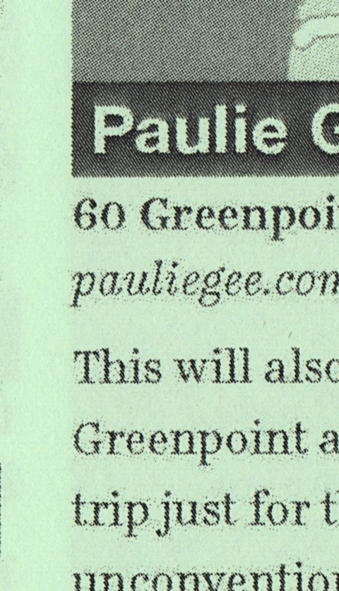
One of the features I’m most excited about in the upcoming New York-themed issue of Pink Mince (order your copy now!) is a selection of photos of men in the West Village in the late 70s by Leonard Fink, whose work is archived at the LGBT Community Center on West 13th Street. I chose a mix of images that felt like they really captured some magical moments of a lost time in the neighborhood, but I may have curated the selection even better than I realized.
I was showing my friend Sina a preview of the issue, and he immediately caught something in an image from 1978 that I missed. Look at this detail:
That’s Robert Mapplethorpe, isn’t it? Suddenly, my photo feature of a lost New York seems that much more poignant.
Type choice and type use
I’m still getting back into the swing of things after an extraordinary one-week trip to Iceland for this year’s ATypI conference in Reykjavík. Although I’ve attended ATypI before, this was the first year I’ve been a speaker, and one lucky enough to be allowed two presentations. The first of them was a variation on talk I’ve been doing lately about typographic issues that should be considered when working with webfonts. Luckily, one of my colleagues was able to record it:
Given at ATypI in Reykjavík on 15 September 2011.
The slides themselves are here, in case you couldn’t see them clearly in the video:
Modern Prometheus
For lack of a paperback to read during a long bus ride, I turned to Project Gutenberg on my phone and started re-reading Mary Wollstonecraft Shelley’s Frankenstein, or the Modern Prometheus. I had forgotten the set-up of the story, in which a third-party narrator — Robert Walton — encounters the doctor while on a polar expedition. But before that happens, Walton is yearning for companionship and writes this tender passage in a letter to his sister:
I desire the company of a man who could sympathize with me, whose eyes would reply to mine. You may deem me romantic, my dear sister, but I bitterly feel the want of a friend. I have no one near me, gentle yet courageous, possessed of a cultivated as well as of a capacious mind, whose tastes are like my own, to approve or amend my plans. How would such a friend repair the faults of your poor brother! I am too ardent in execution and too impatient of difficulties.
Shelley had her own intentions for that sentiment that had nothing to do with why those words are such a kick in the gut to me, but still: sigh.
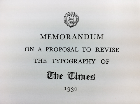
Time and Times again
As satisfying as it was to blow off a little steam with my earlier rant about the misinformation surrounding Times New Roman, I knew that there would still be more to say on the matter. The history of this typeface, as I said, is a murky one that is difficult to piece together, and I was happy at the time to leave it alone.
The esteemed James Mosley, however, sent me a quick message about the post that gave me a little more to consider, so let me pull a few more worms out of the can. James pointed out another lazy bit of reporting from that same paragraph in the same article from The Daily:
“Morison wrote a blistering article in 1929 arguing that Times Old Roman, the font of The Times of London, was dated, clunky, badly printed and in need of help — his help”
I should have jumped on that one, too. The thing is, Morison didn’t attack The Times in any article. (If he did, wouldn’t it have been helpful to say where, since it’s unlikely it would have been in The Times itself?) And while Morison had thoughts about the impropriety of the older types in use, “clunky” is probably not the word he’d use. Morison’s thoughts about the use of type in The Times came in a few stages (as detailed from James Moran’s Stanley Morison: His Typographic Achievement):
- In the summer of 1929, Edmund Hopkinson of The Times asked Monotype about taking some ad space in a special supplement. “Morison startled Hopkinson by saying quite bluntly that he would rather pay The Times £1000 to keep their hands of a Monotype advertisement. He continued by giving Hopkinson a lecture on the bad printing and out-of-date typography of his newspaper.”
- Hopkinson passed these comments along to William Lints-Smith, manager of The Times, who met with Morison about these critiques, and offered him a job as a typographic advisor, which Morison eventually accepted.
- After proposing at a conference on 24 October 1930 that a completely new typeface would be the best solution to the paper’s typographic troubles, Morison prepared a 34-page memorandum about the typographic issues, used for the benefit of a committee charged with looking into his proposal. 25 copies of this were prepared, and most were destroyed later on.
So his critiques were severe, but hardly public. In fact, his public writings about the paper’s type history, such as in the 1929 printing supplement and the Monotype Recorder later on, are quite neutral in tone.
James also wonders if the misleading image from the Recorder that has caused so much confusion about the name of the older type was Beatrice Warde‘s idea. I thought that was likely, too, so I put the question to Dr Shelley Gruendler, the best source of info on Beatrice that I know. In her words:
I have no recollection of EVER knowing specifics about a cover unless she wrote about it to her mother or Gill or someone. However, she loved clever phrases (her type poems & limericks demonstrate this) and since she was the ‘editor’ (and essentially the ONLY writer for it, I’d assume that she had everything to do with it. Of course, she wouldn’t have shot it herself or flipped the neg to print it, nor would she have set it (a lady would never get her fingers inky!), but I’d bet the bank that it was all her and nobody else.
Like a lot of people, James is also skeptical of the official line that Times New Roman is the result of Morison’s vision and Victor Lardent drawing skills. I referred to this as the “more fully documented” story, because it’s the only formal credit given, and records to suggest otherwise are patchy. The thing is, even if William Starling Burgess never had a hand in the genesis of Times New Roman, it’s almost certain that Morison wasn’t the one who made it work as a type design. The real ghost figures in most of the early Monotype faces were Frank Hinman Pierpont, the manager of the Monotype Works in Salfords (the same site where our UK office is today), and especially Fritz Steltzer, the German-born manager of the type drawing office. These guys and the staff they managed would have been the ones who took Morison’s concept, as expressed in Lardent’s drawings, and refined the drawings, worked out the spacing, made the adjustments for different sizes, and so on. Lardent’s drawings for Times New Roman are gone, but I’ve seen reproductions and they show the spirit of the final type, but not the details.
Steltzer, in particular, is an enigma. There’s almost nothing written about him, although people familiar with how the drawing office worked are quick to note the influence and skill he had. From 1899 until he was interned during World War II (he apparently retired once he was freed at the end of the war), Steltzer supervised all the work in the drawing office, and even trained most of the staff himself, many of whom were recruited from the local school in nearby Reigate.
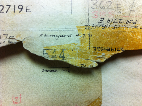
And what about that staff in the drawing office? How much credit should they get? In general, they were the hands that produced the drawings, but not really typographers who had an eye for the overall design. A rarely discussed detail, though, is truly worth mentioning: many hands worked on each typeface, and most of those hands belonged to women. If you look at the master pattern drawings, there’s an initial, a last name, and a date on each one (and often more of the drawings were modified later on). Most of the drawings were executed by E. Banyard, M. O. Donnell, A. Johnstone, D. Laing, M. Morris, D. Newman, W. Pooley, and D. Pritchett. Robin Nicholas, who started out in the drawing office in 1965, clarified some of those as Enid Banyard, Dora Laing, Daisy Newman, Miss Pritchett, and Miss Pooley. (Since they were always referred to as “Miss”, he’s not sure of their first names, even though their time at Monotype briefly overlapped.) Dora Laing was in charge of the drawing activities themselves, while Fritz Steltzer looked after the department as a whole, but I can’t say whether Dora’s role was more one of coordination or quality control of the work itself.
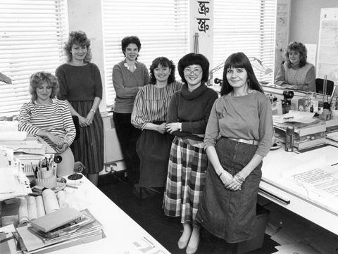
[Sidenote: The role of women in type history has been a big one, even if the debate about inequality in the industry rages on. Note the people working with Fiona Ross in Linotype’s Non-Latin drawing office in Cheltenham back in the day:]
I think that much of the confusion about credit for type designs such as Times New Roman and others produced by companies like Monotype and Linotype in their early decades comes down to a lack of a notion of design authorship. The word “design” was being used more and more often, but in practice the production of type in these environments was still more related to the trade of punch-cutting, just expanded to an industrial scale. It was very much a large team of people who brought type into the world, many of whom had very specific roles in the process, but still crucial to overall quality of the end product. Morison, for instance, may have had the idea and certainly had the publicity, but he didn’t get those letters to work as a typeface. Pierpont, Steltzer, and the staff of the drawing office made a working system out of the ideas, not just for Times but for many other families.
Prime
I’m this much.
Style Sheets

Wonder Woman style sheet, 1982
Web Designer tips
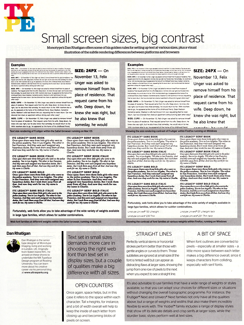
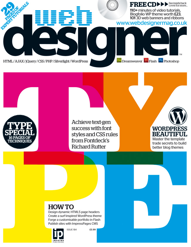 Just a quick one for the clippings file: I wrote up a few quick tips about choosing typefaces for the web (or any screen-based project, really). Nothing major, but some ideas to chew on. This is from the web typography special issue Web Designer magazine (no. 184).