“I work very hard to make sure that the men I draw having sex are proud men having happy sex!” – Touko Laaksonen, better known as Tom of Finland.
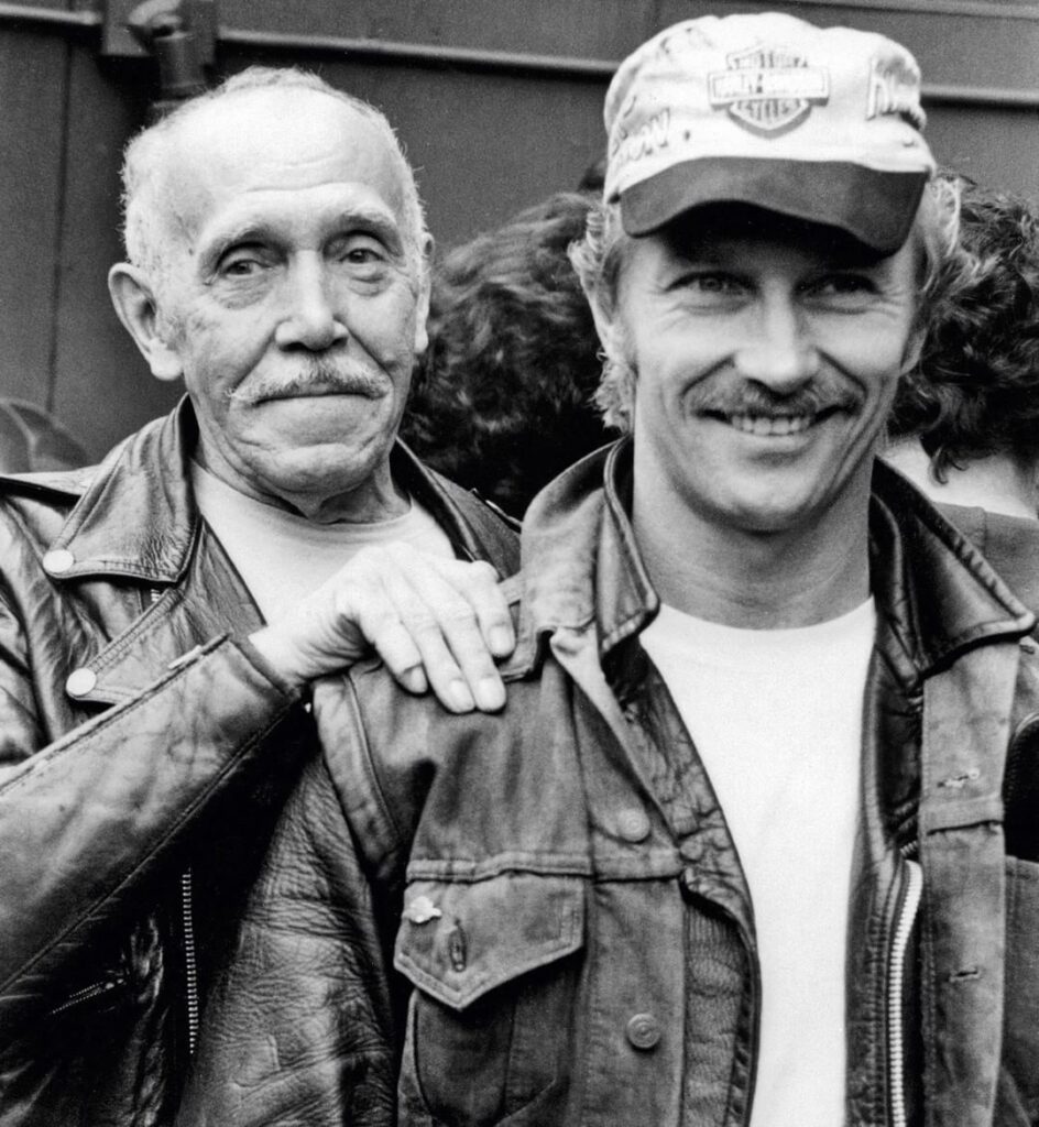
Picture: Tuoko Laaksonen (May 8, 1920 – November 7, 1991) and his protégé Durk Dehner, The Eagle, San Francisco, California, 1985. Photo by Robert Cruzan.
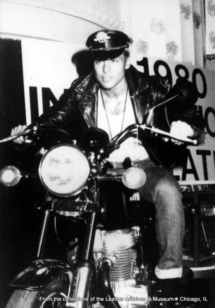
In 1956, Finnish artist Touko Laaksonen, who was born ninety-seven years ago today, submitted drawings to “Physique Pictorial,” an influential American muscle magazine, under the pseudonym Tom; the magazine’s editor credited the drawings to Tom of Finland, and an iconic career began.
Over the next three and a half decades, Tom of Finland’s illustrations—which typically presented hypermasculine men in overtly homoerotic settings—stood in direct contrast to mainstream imagery of gay men as the archetypal “sissy.
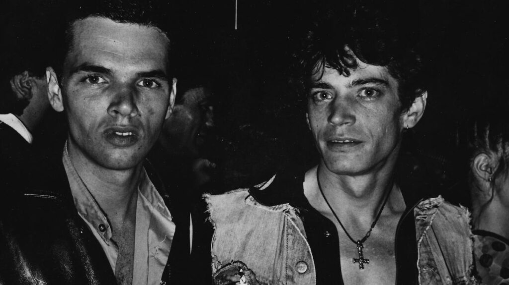
Tom of Finland’s work, or at least the culture it inspired, continues to impact the gay community today. Dr. Susan Stryker, for example, argues that the rise of the Tom of Finland-inspired “clone look” in the mid-1970s “signaled the return of a more gender-normative expression of male homosexuality. At the cultural level, it is possible to trace the current ‘homonormativity’ of mainstream gay culture (an emphasis on being ‘straight-looking and straight-acting’), as well as the perceived lack of meaningful connection to transgender communities among mainstream gays and lesbians, to the shifts” in the mid-1970s. Stryker does not suggest, nor do we, that Tom of Finland himself had any intention other than to create his unique brand of homoerotic art, but his work nonetheless must be viewed in a larger context.
Touko Laaksonen died of an emphysema-induced stroke on November 7, 1991; he was seventy-one. (at San Francisco, California)