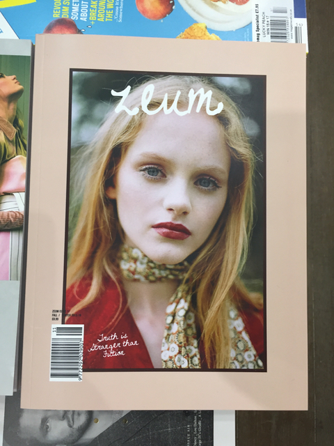
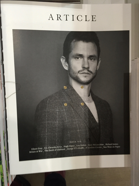
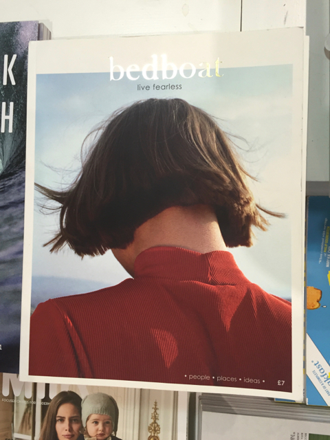
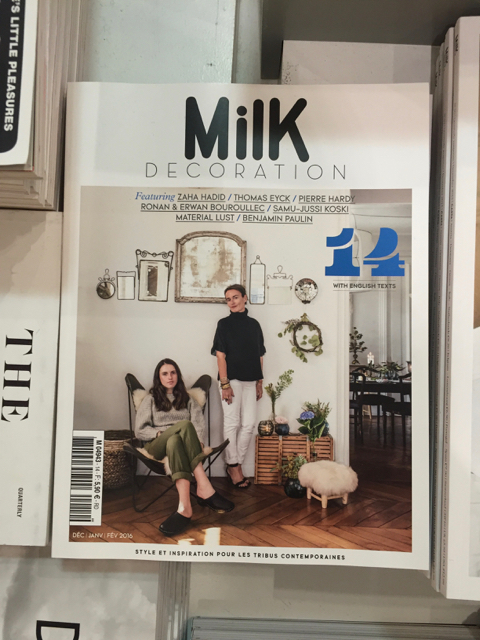
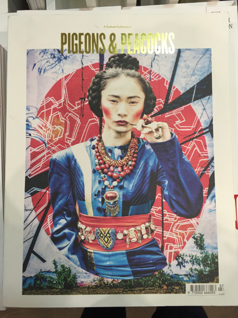
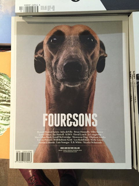
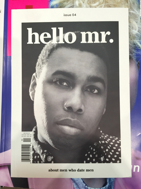
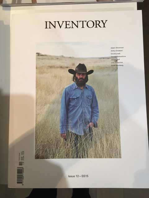
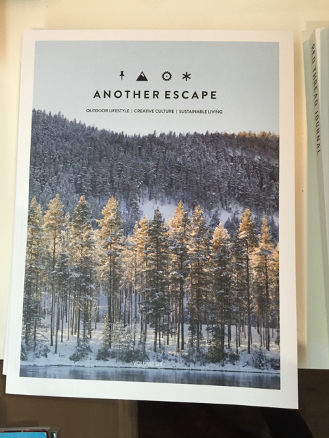
A couple of years ago I wrote about a trend in magazine cover design that felt like was becoming a real cliché — centered title, single image with a border, maybe a bit of non-hierarchical list about what’s inside. After a recent visit to the newer, larger Magma shop in Covent Garden, I can see that this very homogeneous style for independent mags is still deeply entrenched, and spreading.
