You know when you’ve been noticing something creep up on you over time? Things you begin seeing, filing away, forming into a pattern? Yesterday, I was looking at a bunch of projects by student designers, and a certain trend snapped into focus. It was so instantly, immediately clear the first time I saw an example, and by the 6th I was really frustrated that so many people had veered toward the same solution without thinking much about context. I worry about things like this in design — especially when I see it in student work — because I began to worry that a style becomes a tic, a reflex that may not be questioned or considered well enough.
You try. Can you notice the pattern forming, the approach that has become a kind of template for a certain kind of work?
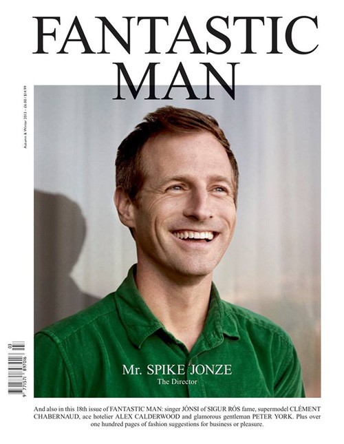
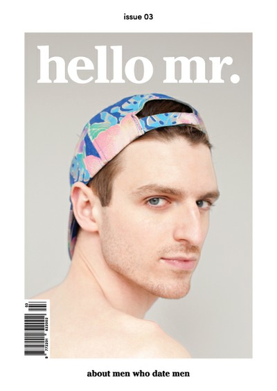

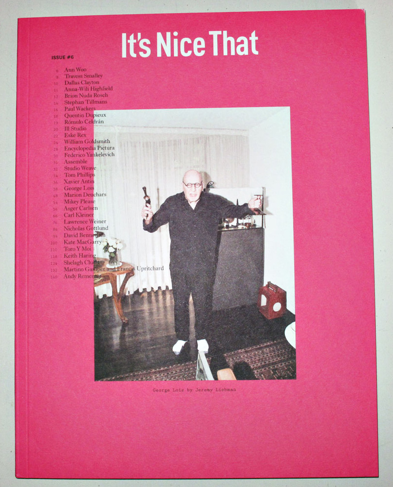


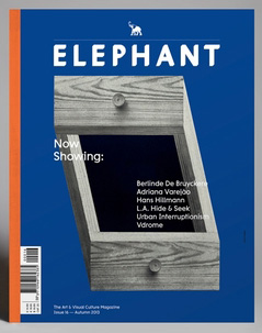
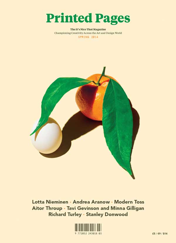
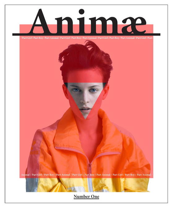
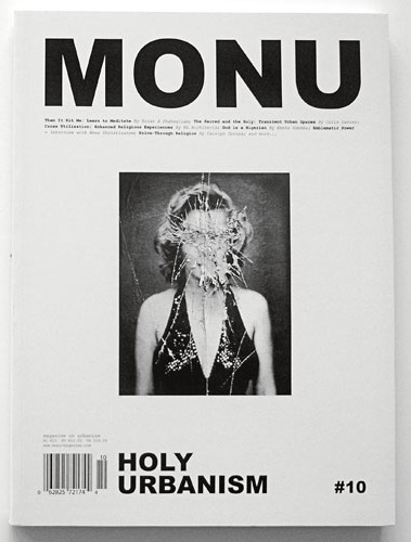
You already figured it out, I bet.
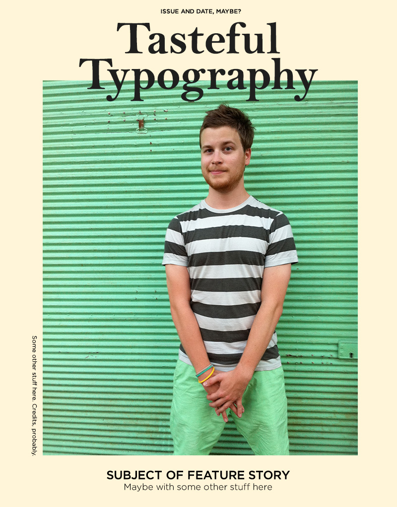
The thing is, these are all really good magazines — some of my favorites, actually, so I guess my consumer habits are part of the problem. When I saw so many covers based on this basic model, those were well-designed, too. When a certain trick hits critical mass, though, I think there’s a risk of designers not asking themselves why a certain solution was appropriate in the first place, and just following along to align themselves with a certain tribe. That’s exactly the time to look more deeply at the “why” and take advantage of the opportunity to contribute something new, rather than get more deeply entrenched in a habit.
[Cover model: my pal Michi from the Typejockeys]

Good collection of this trend, Dan. Similar fads are cataloged at Trend List.