A few people have been asking about how Sodachrome actually works, and how a user would assemble the pieces to work properly. It’s actually a lot simpler than it might seem: no crazy OpenType features, no complex setting. It’s just two simple fonts that can be set independently, or — ideally — set on top of one another, either by overprinting separate color plates, or by using transparency modes to blend the layers if you’re going all-digital.
First, let’s have a quick peek at the first font — Sodachrome Left:

And now, Sodachrome Right:

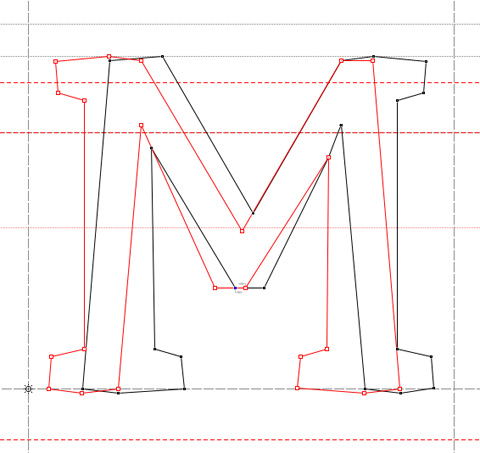
You can see that the shapes on their own are pretty odd looking. Getting them to work together was a bit of a trick, so we found it easiest to draw both outlines for each glyph at the same time, using just one Fontlab file:

After the two outlines were drawn for each glyph, we separated them into two files and then exported a font from each. After that, it’s just up to users to manipulate those two fonts as they see fit.


Thank you!
(I should add that, seeing the two “sides” individually, I kind of like them on their own.)
Uh…I think I just had a nerdgasm.
Excuse me while I clean up. (Nice work, Dan!)
-sw
This is great, Dan.
Dan this is brilliant! Especially the surprise hidden sans serif.
I’d luuuuuv that in a font available!
Very impressive, and very clever!