Most of my side projects have organically spun out from one another, and all tie back to my pretty deep interest in typography.

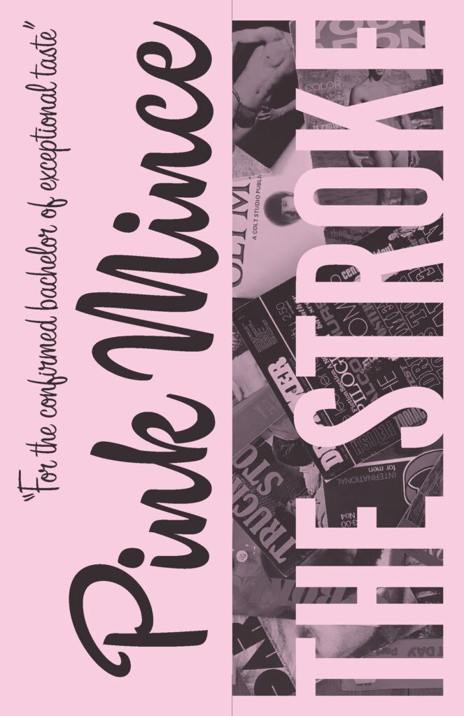
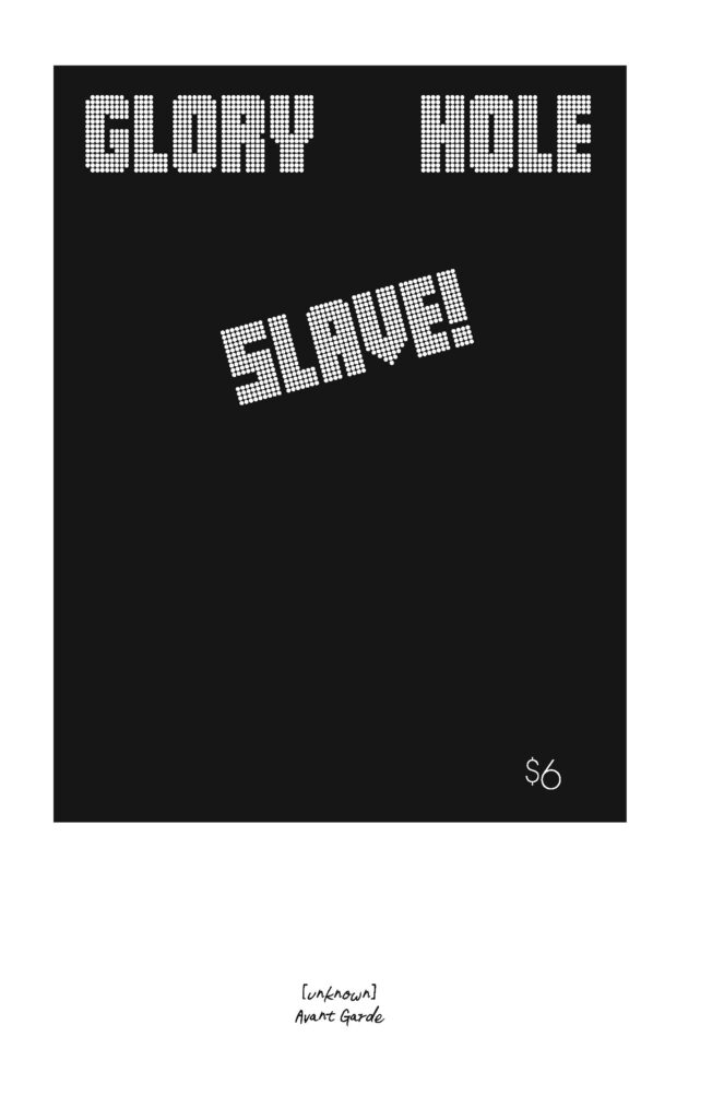
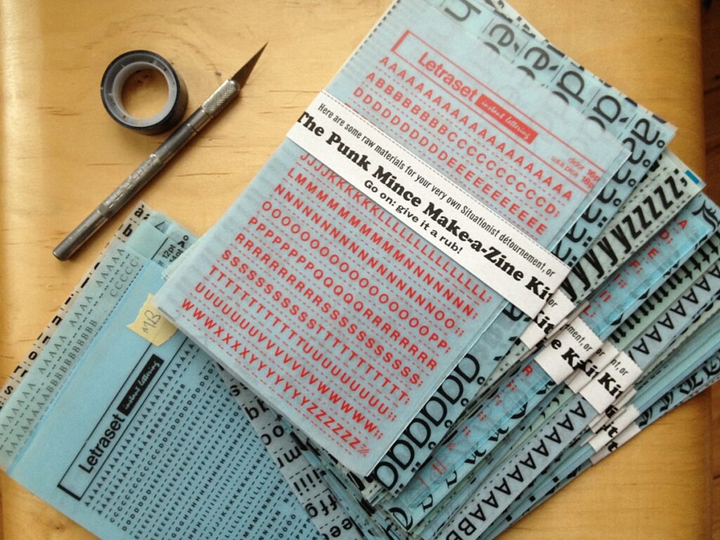
Pink Mince was at first an effort do something creative — to somehow use type and my other graphic skills — as my day designing type took me further from actually doing much type. For Pink Mince #9 — Punk Mince — I started gathering old sheets of Letraset, which got me thinking about how Letraset was such a huge part of the graphic landscape in a certain era. I began paying attention to where those typefaces showed up, and that eventually led to Pink Mince #12 — The Stroke — where I recreated the typography from a bunch of old gay porn magazines. While preparing those cover designs, I had to actually identify all the typefaces used, and pay close attention to how they were set. For one of the covers, the original type was nowhere to be found, so I had draw it myself, and this eventually became the first Bijou release, Gloridot. To draw that type and duplicate all those covers accurately, I began tracking down original copies of images I had found on Tumblr so I could better see the details. THAT made me pay even more attention to the type that was available in the era of dry transfer, which caused me to collect yet more Letraset. Eventually, I needed to keep track of what I was collecting, and the wording slowly turned into proper research (slow and informal research, but still). The typefaces that I have so far released as Bijou Type have grown out of the magazine research that I have been doing for quite a few years now. You see the cycle, right? Pink Mince to Letraslut (and its online shop) to the Hot Type Club to Bijou Type.
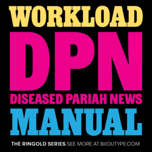
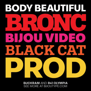
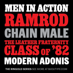
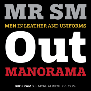
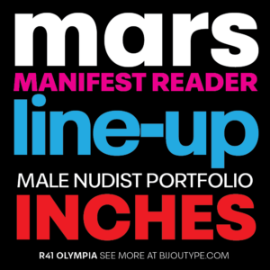
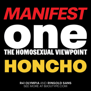
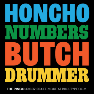
To bring it all back around and show how my typefaces were designed to tap into a variety of aesthetic trends seen across the magazine collection, many of which were originally set with Letraset, it only seemed appropriate to make some specimen artwork to show off the results.

