Perpetual Professional Burn-Out

Ah, the holiday season — the time of the year when I invariable get a minute or two to catch my breath and reflect upon how exhausted I seem to be by the end of each year. It doesn’t take any deep reflection to know why: I do too much, and too much of it at once, because I constantly chase too many parallel interest and side hustles, and I exist in a state of almost perpetual over-commitment. I’m interested in too many things! Since I am lucky that I can earn a living by doing things that I enjoy anyway, work tends to bleed into non-work, and hobbies overlap with my profession.

An Instagram story prompt had me thinking today about how much I have actually done for work and work-adjacent activities over time. It’s…a lot. (And I say this while feeling a huge amount of shame over letting yet another work-adjacent project blow its last deadline because I haven’t had the time to properly concentrate on it.)

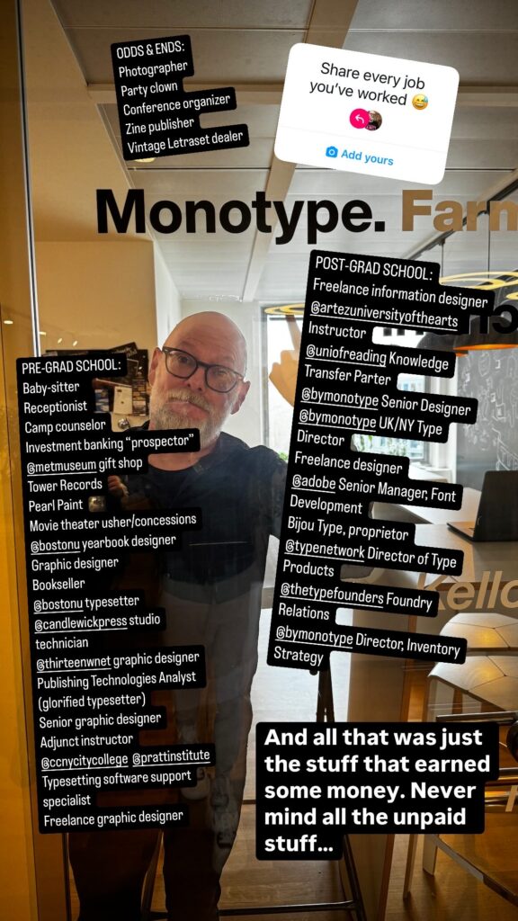
Twenty years ago (!), I published a post about my real résumé — all the jobs I’ve had, not just what I would list on a CV — and that was already a lot. So, let’s see what I’ve been up to since April 2004…

Continue reading “Perpetual Professional Burn-Out”

A little too queer

I am back in Brazil for the first time in 25 years or so, and it is still a delight. São Paulo is a very different vibe from Rio de Janeiro — it’s the NYC/LA conflict of South America — but it’s all still warmth and magic to me, with a dash of economic disparity and culture shock.

My last trip was an extended holiday vacation, while this was a week of work-related type nerdery surrounding the DiaTipo conference. I led a workshop on marketing type foundries and fonts, and gave the final keynote. (Hopefully there will be a recording to share eventually.)

One teeeeeeny little bit of tension about the event is that is held at a Presbyterian university — in a country that continues to struggle with religious conservatism — and the truly terrific team organizing the conference are mostly very queer. They have unfortunately had to struggle a bit with their host, and I think that my proposed talk may have ruffled a few feathers. (Maybe it was the slides showing just the titles of gay magazines, maybe it was general openness about the queerness of my life and my work.) I’m lucky that I am at a place in my life and career that I can get away with openness like that, but I hope the organizers’ desire to include me didn’t cause more stress for them.

So, as a show of appreciation for this wonderful, energetic team of young people who stood by me, I just want to say that I am impressed with them, and I deeply grateful for their hospitality, and I just hope my example offers a little bit of courage to keep on keepin’ on.

Just look at all those beautiful, enthusiastic faces! We were all really lucky to work with such a magnificent crew.

Hot, Slutty, Pink Bijou Type

Most of my side projects have organically spun out from one another, and all tie back to my pretty deep interest in typography.

Pink Mince was at first an effort do something creative — to somehow use type and my other graphic skills — as my day designing type took me further from actually doing much type. For Pink Mince #9 — Punk Mince — I started gathering old sheets of Letraset, which got me thinking about how Letraset was such a huge part of the graphic landscape in a certain era. I began paying attention to where those typefaces showed up, and that eventually led to Pink Mince #12 — The Stroke — where I recreated the typography from a bunch of old gay porn magazines. While preparing those cover designs, I had to actually identify all the typefaces used, and pay close attention to how they were set. For one of the covers, the original type was nowhere to be found, so I had draw it myself, and this eventually became the first Bijou release, Gloridot. To draw that type and duplicate all those covers accurately, I began tracking down original copies of images I had found on Tumblr so I could better see the details. THAT made me pay even more attention to the type that was available in the era of dry transfer, which caused me to collect yet more Letraset. Eventually, I needed to keep track of what I was collecting, and the wording slowly turned into proper research (slow and informal research, but still). The typefaces that I have so far released as Bijou Type have grown out of the magazine research that I have been doing for quite a few years now. You see the cycle, right? Pink Mince to Letraslut (and its online shop) to the Hot Type Club to Bijou Type.

Continue reading “Hot, Slutty, Pink Bijou Type”

Stop! The name of love.

Earlier this year, the Italian type foundry Reber R41 released R41 Stop, a revival I designed for them on commission. R41 Stop, of course, is based on Stop, the distinctive design released in 1971 by Nebiolo, designed by Aldo Novarese with help from others in the Nebiolo studio. This version that I designed for Reber R41 is specifically based on the version of Stop that they manufactured as dry transfer type. The design is fundamentally the same, but a careful digitization of the original glyphs reproduced for dry transfer reveals certain subtle differences in curvature. I wish I could discover more about the R41’s process for preparing artwork for reproduction — whether they prepared new stencils like Letraset, whether they photographed existing artwork, or some other method. Alas, the information seems lost.

In reviving a typeface that I love as much as I love Stop, I didn’t want to simple reproduce what had existed. I wanted to do that part of it well, but it was also very important to me to add more to the concept. I wanted to take Stop further, so I could feel like I truly earned some design credit that could sit alongside Novarese’s. I added additional symbols, support for Cyrillic and Greek, and a number of alternative character forms based on the ways that people have hacked Stop’s design over the years. In making a version Stop that was specifically derived from R41’s dry transfer product, I tried very hard to honor that material legacy, and design the new glyphs whenever possible to look like they could have been made out of existing shapes from the basic sheet by a decent designer with a scalpel and a steady hand.

You can see R41 Stop on the Bijou Type site, purchase a license from R41 or Type Network, or activate it with Adobe Fonts.