One of the ongoing goals of the Hot Type Club is to find out more about who designed all these classic gay mags, and how they went about it. It’s tough to find out much detail about how magazines were produced — the gritty details of production tasks and working methods — since it’s not something the general public seem to care much about, I suppose. Or at least the process seems so unremarkable when it’s happening, and it’s only in retrospect that practical details look more like a valuable piece of history.

Many of the magazines in my archive are so far off the beaten commercial path that they infrequently include any colophon at all, never mind any credits for design, typesetting, or printing. When they do, it’s great to have clues about who the people were who were bring these magazines to life, especially if the titles are from the era before Christopher Street, back when gay-interest titles were more underground, if not downright illegal.

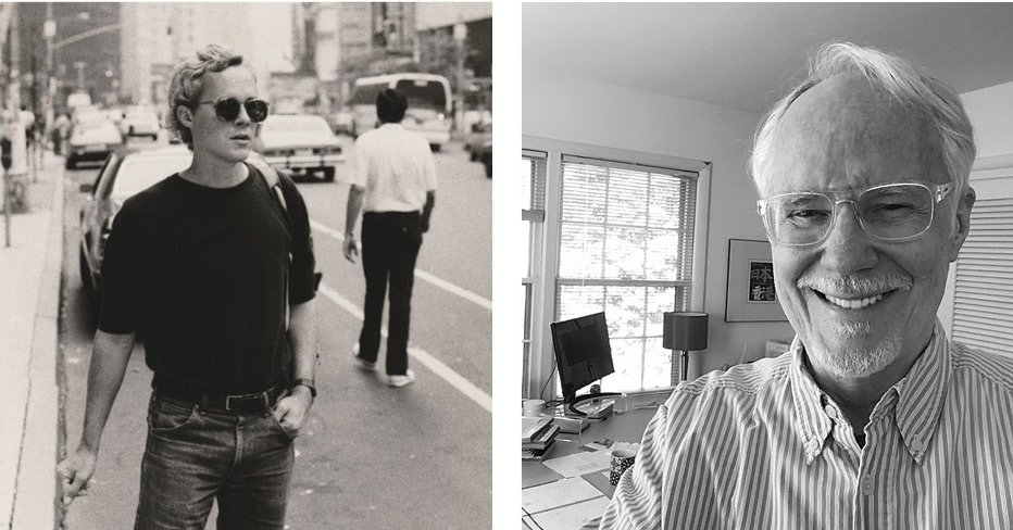
Thankfully, the Society of Publication Designers (my brief stint as a board member of that organization feels like a lifetime ago!) has published this illuminating interview with Rick Fiala, art director for the first few years at Christopher Street magazine. While I appreciate that parts of the interview give some history and context for the magazine, and its place in gay publishing history, what I really adore are Fiala’s straightforward descriptions of the design and typesetting process:
“I didn’t really know how to lay out a magazine. But editor Sharon Delano came over to my apartment one day with mechanical (i.e., layout) boards from the Review, long, loose paper columns of text, some clipart, and a waxer. She taught me how to lay out articles with art, plan for captions and ads, and when to let editors know if lines had to be cut.”
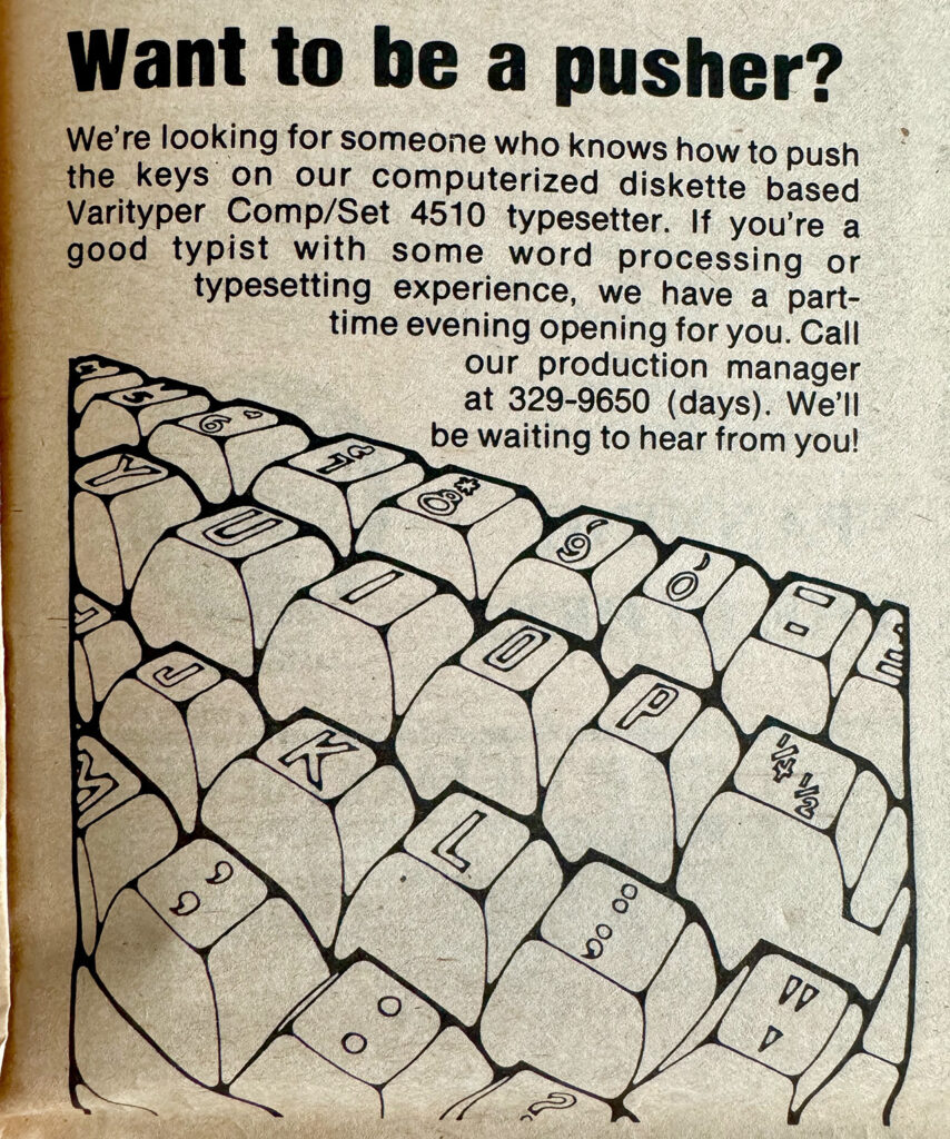
“We had accounts at a nearby office supply store, a photostat shop, and a type-setting place. The typesetter was for display type only, because the columns of text would be set in-house with an IBM Electric Composer, which, I think, we rented.”
“I thought that the logo and cover lines on the Gore Vidal cover looked too tight. When I stacked the logo, it automatically produced some white space on both sides of the word ‘Street,’ and made the photo under it pop more. The staff really like it, and we settled into that format as a look for the magazine for the next year-and-a-half.”

