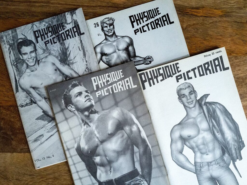
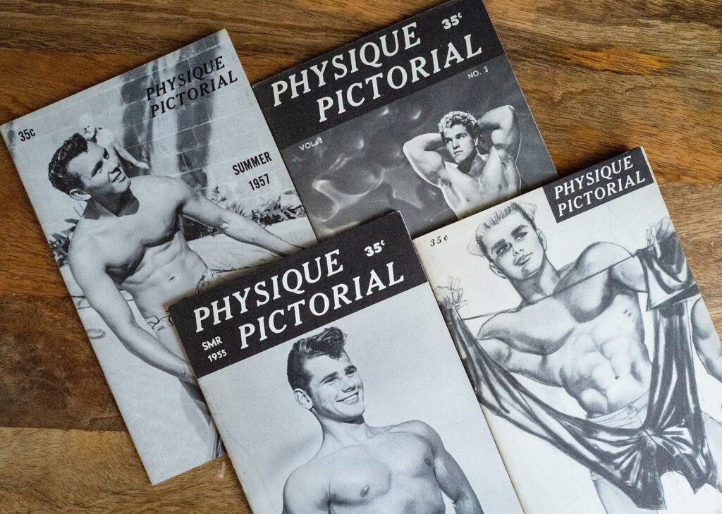
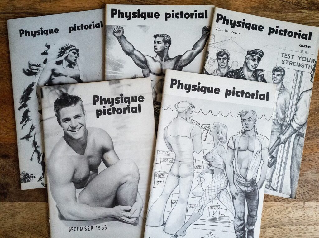
It took many years of patience, luck, and persistence (and more than one ill-advised outrageous price), but I have managed to collect just about every issue of Bob Mizer’s Physique Pictorial. (Vol. 2 no. 1, I know you’re out there somewhere, but I probably can’t afford you anymore.)
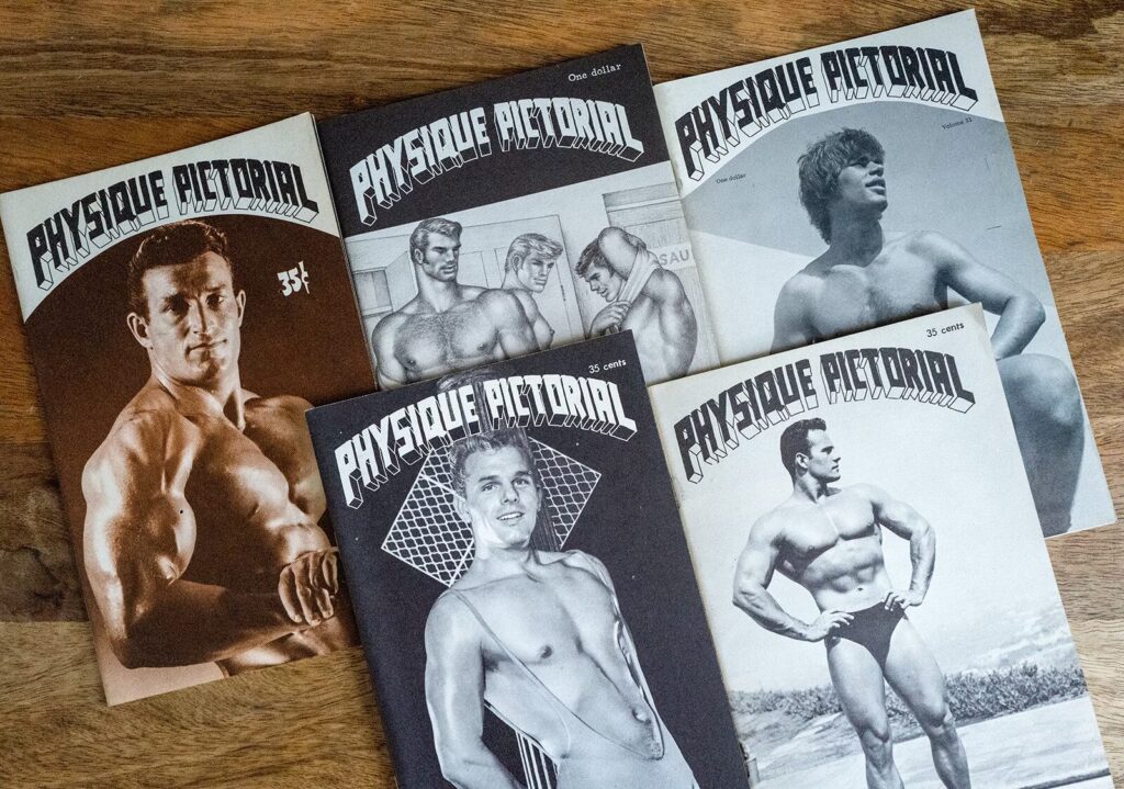
Mizer is best known for his photography and filmmaking, but less so for the design and typography of Physique Pictorial. In fact, the magazine always had a fairly crude, almost punk approach to its layout. Text and labels were often set with a typewriter, and you can see the evidence of its cost-and-paste production methods, from the first issue in 1951 all the way through to Mizer’s last in 1990. Even though his last couple of issues feature cover titles made with crude digital fonts, the magazine’s layout was very much an analog process.
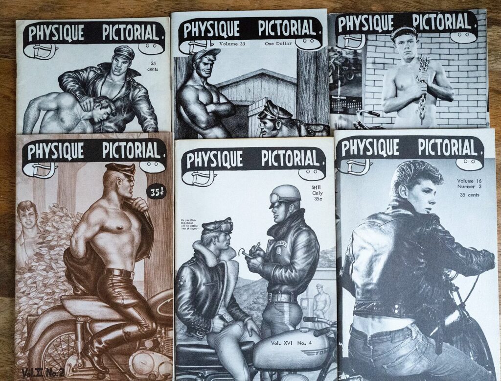
When looking at the entire run of Physique Pictorial, it’s clear that Mizer was pretty economical in his use of materials. That’s not to say that the magazine looked cheap. In fact, I’ve always been quite fond of the immediacy of the type and layouts, and Mizer’s emphasis on the photography and illustrations. Over the years, though, Mizer used a handful of pieces of artwork for the cover masthead over and over again. Whether he did it for thrift or for variety in the covers, the same few title treatments appear periodically throughout the entire 40-or-so years of the magazine’s run. Knowing that the magazine was assembled by hand, the reuse of these art elements suggest that Mizer kept the artwork on hand for decades, applying it as he saw fit.
