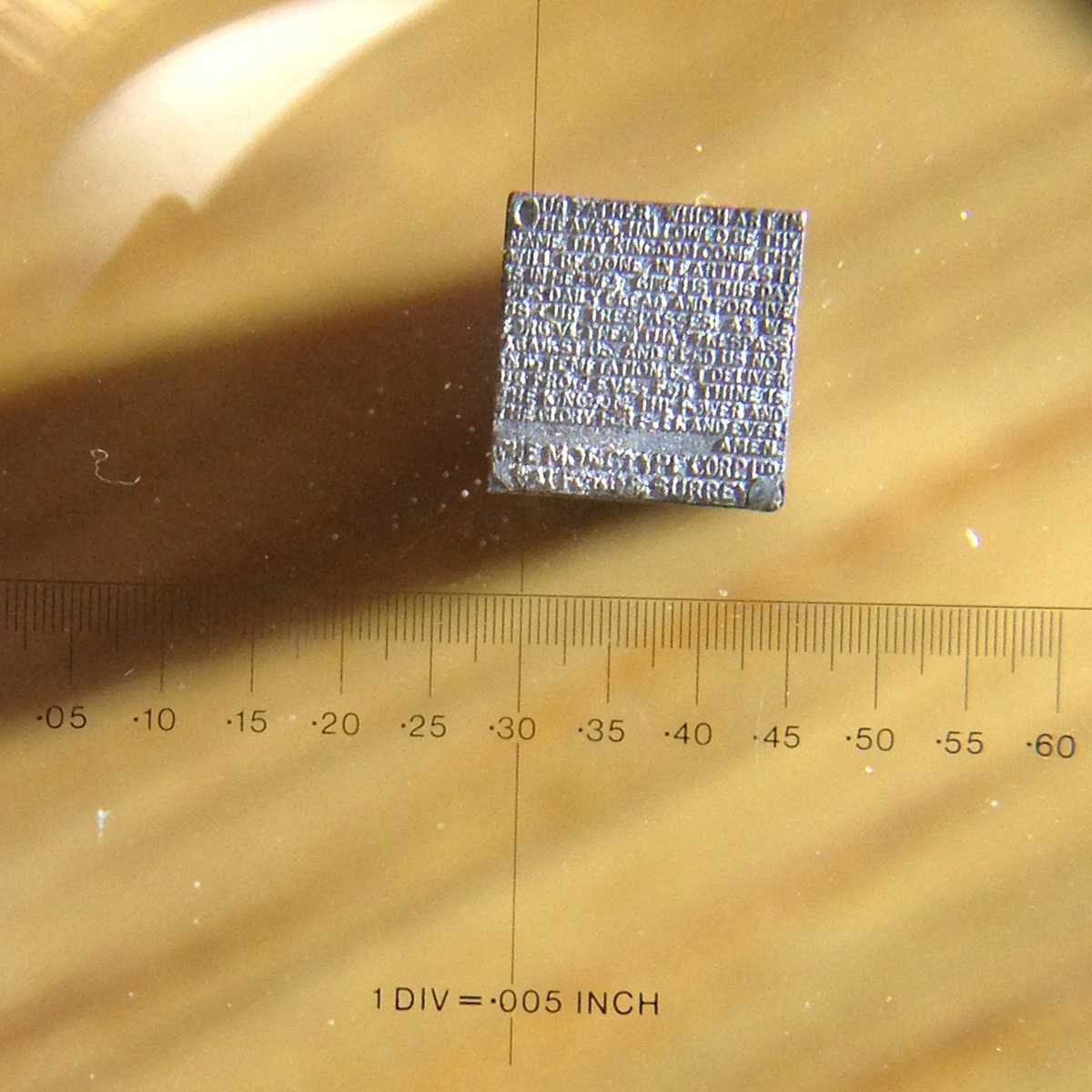
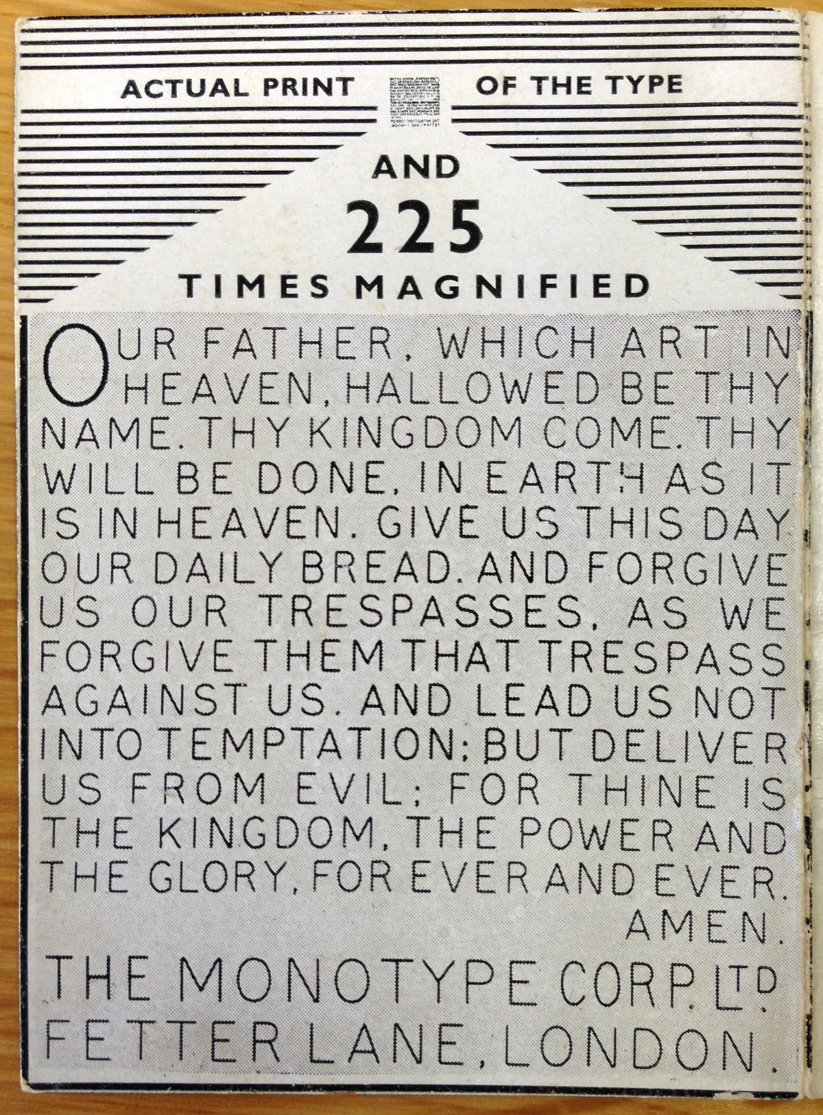
An old foundry trick for showing off the precision of punch-cutting and typecasting abilities is to make something at a breathtakingly small size. This Typophile discussion about Roger Excoffon’s beautiful, bonkers typeface Calypso reminded me to dig out Monotype’s own example of punch-cutting prowess: the Lord’s Prayer on a 12-point square piece of type:

According tot he accompanying leaflet, each letter measures .008 inch from top to bottom. Monotype’s manufacturing methods were famously precise, holding tolerances down to .0001 inch. Those tolerances at every stage are part of the showmanship here. Producing a piece of type with such fine detail is the last stage of a process that starts with a 10-inch drawing that is reduced to a 4-inch copper pattern that is reduced to a full-size steel punch that is struck into a brass matrix that is used to cast the lead type. And that’s just the bare-bones explanation of what’s involved.
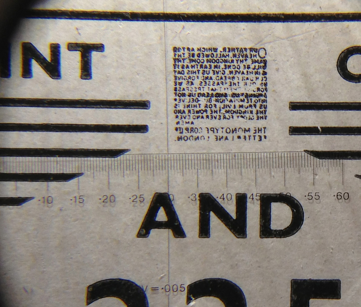
A sharp eye will notice that the text on the face of the piece of type is right-reading, while a typical piece of type will be in reverse so that it prints properly. This small piece of lead was meant to be seen through a magnifying glass, a bit of showing off — not for printing. If you look at a printed sample through the same magnifier, you can see that printing the type was much a much sloppier affair than cutting or casting it:


