Ever since I first found this cover to a gentleman’s magazine on Tumblr, I’ve been perplexed. First, let me say that I think that is a brilliant piece of graphic design, regardless of what you may think about the subject matter. The composition is superb, there is a spare use of only the most essential elements, and the typography is exquisite.
It’s the type that has been a captivating mystery. Obviously, that title is set with Stilla, François Boltana’s sublime titling face from 1973. But I had never seen that swash L in any version of the font before. Letter-by-letter, Stilla is gorgeous. However, all those exuberant shapes often fit together very awkwardly, so it’s a difficult face to use, especially in all caps. An L that drops below the baseline like that is just what would be needed to pull off a word like BOLD (as well as some very careful letter spacing). I wondered if that version of the L had been drawn separately and pasted in alongside the type, but that really seemed like overkill for a stroke mag.
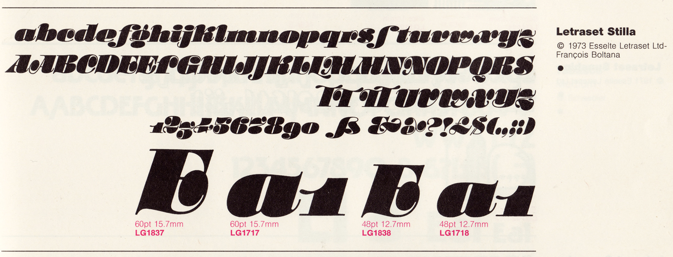
I should have guessed that my trusty 1989 Letraset catalogue would hold the answer:
There it is. The very swash L I’d been wondering about, as well as a couple of TT ligatures to help out that tricky combination. I found a sheet of Letraset Stilla recently, but it was only the lowercase letters. It wasn’t until I was checking a detail of that sheet in the catalogue that I noticed the solution to the puzzle.
Things like this are all too common, unfortunately. It was perfectly feasible — and often invaluable — to have alternate characters with Letraset, a product that required letters to be chosen and applied one at a time, with care. Those extra touches are the sort of thing were rarely carried into the early days of PostScript fonts, with their meagre limit of 256 characters (many of which were reserved by generic symbols). Unless fonts proved to have enduring popularity, those lost elements tend to be forgotten. Maybe, if I have a few spare hours at hand, I can sneak the extra characters back into Stilla. Hmmmm, maybe that’s exactly what I ought to do…


