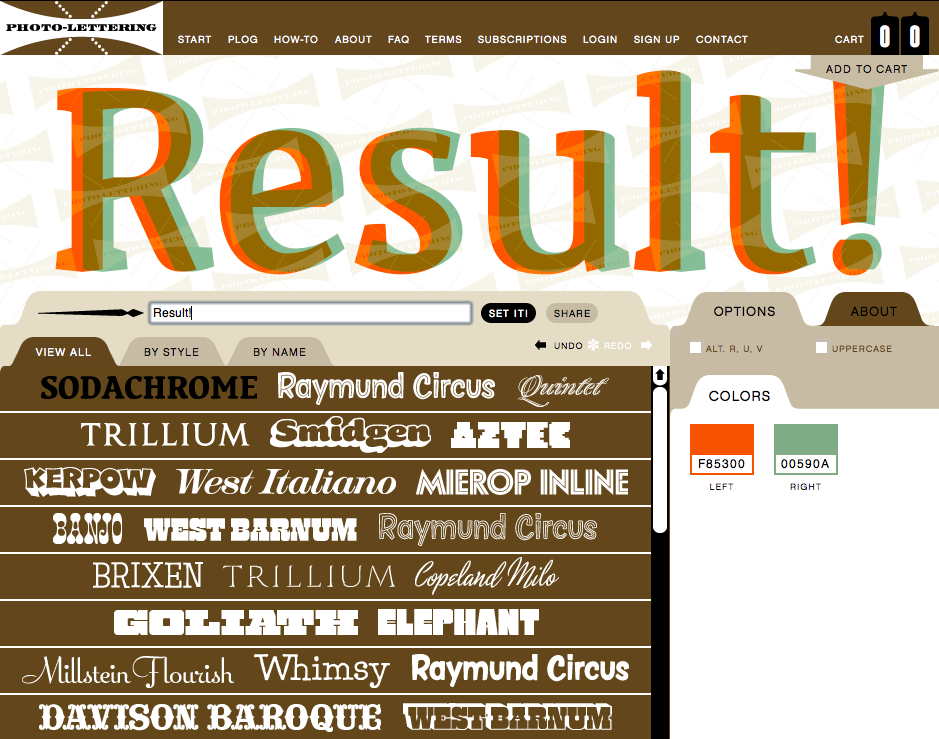
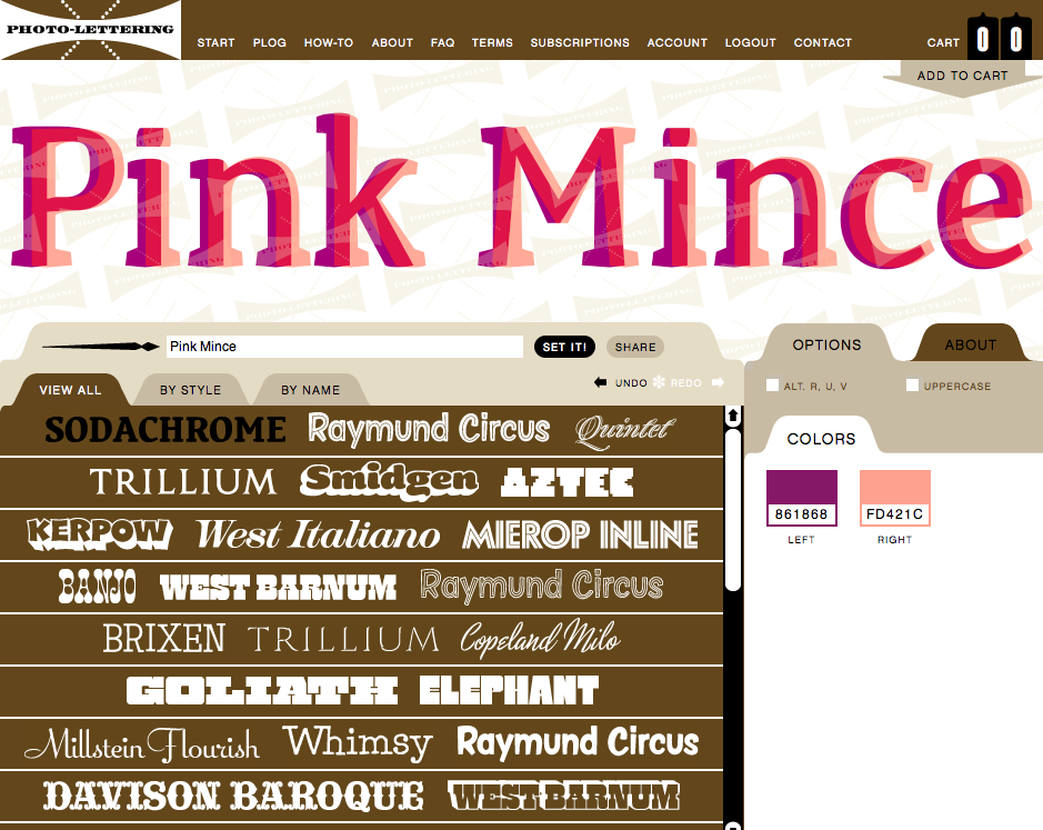
I have already mentioned — on quite a few occasions — an eccentric typographical experiment called Sodachrome that my friend Ian Moore and I designed for our friend Rathna. Ian and I have always been very proud of Sodachrome, but as a set of fonts it’s a design that is cumbersome to work with, and certainly the kind of a display typeface where a little of it goes a long way. So even though the design was finished years ago, it has languished a bit for lack of the proper outlet, aside from occasional licenses we granted (with instructions for how to deal with the tricky fonts) along the way when people asked.
Well, I’m pleased to announce that Sodachrome has finally found the perfect place to live: The Photo-Lettering collection, from my esteemed pals at House Industries. I’ve been a big fan of the PLINC collection and service right from the start, having awaited the launch for years after hearing the idea of it discussed at a conference.
PLINC includes a lot of superb, exuberant typefaces, but what has always been more interesting to me is its model. Rather than just offering licenses for display fonts that may only have limited utility, PLINC uses a custom-built typesetting engine to offer downloadable headline settings of just a few words at a time, much like the original Photo-Lettering company did with its massive phototype library. It’s a fascinating idea, and part of what got them a nomination for the Designs of the Year at London’s Design Museum.
What PLINC really accomplishes is the ability to play with colour and transparency to reveal what Sodachrome’s design is about, and make it much easier to implement that typical layout software. So yay! A match made in heaven.
Continue reading “A home for Sodachrome — at House Industries”


