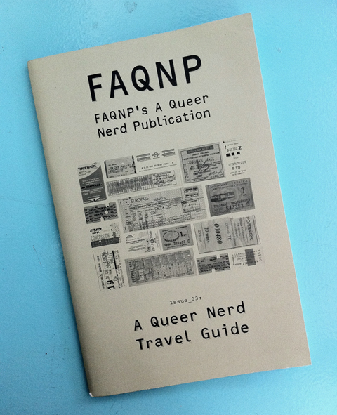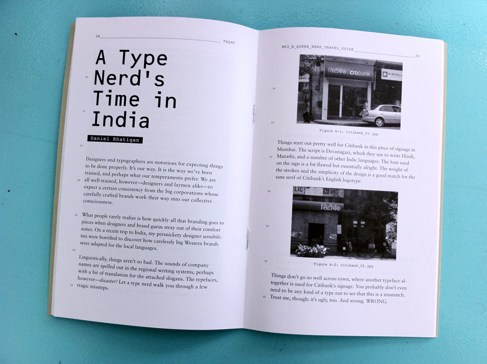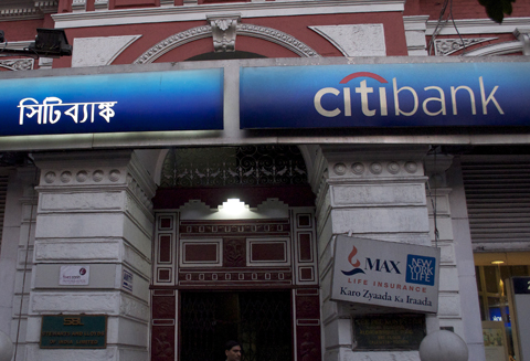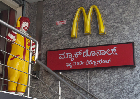
I contributed an article to the zine FAQNP for its third issue, “A Queer Nerd Travel Guide”. My photo feature, “A Type Nerd’s Time in India”, is a look at how well (or for the most part, how badly) a variety of western brands like Citibank and McDonald’s carry through their typographic branding when they use the local scripts in different Indian cities.

Designers and typographers are notorious for expecting things to be done properly. It’s our way. It is the way we’ve been trained, and perhaps what our temperaments prefer. We are all well-trained, however — designers and laymen alike — to expect a certain consistency from the big corporations whose carefully crafted brands work their way into our collective consciousness.
What people rarely realize is how quickly all that branding goes to pieces when designers and brand gurus stray out of their comfort zones. On a recent trip to India, my persnickety designer sensibilities were horrified to discover how carelessly big Western brands were adapted for the local languages.


You can order a copy of FAQNP #3 from their website or find them in select stores.
