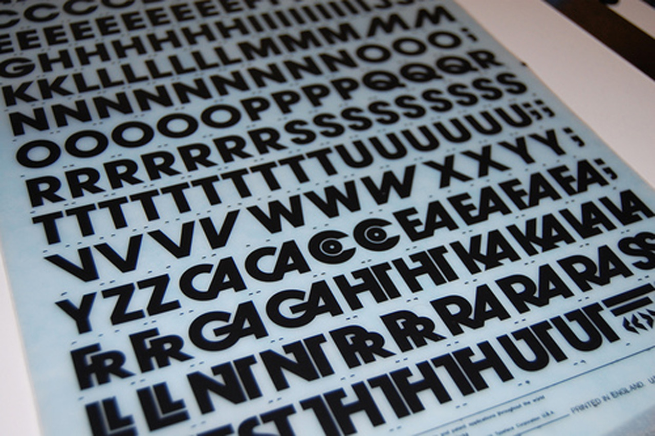
I spent the day working on a custom version of this typeface, thinking that it’s one of those designs that only seems to deserve its fame when it’s used just right, but the rest of the time feels a bit off. I don’t love it, but I have a deep affection for it. Avant Garde was, after all, the typeface that turned me into a typographer.


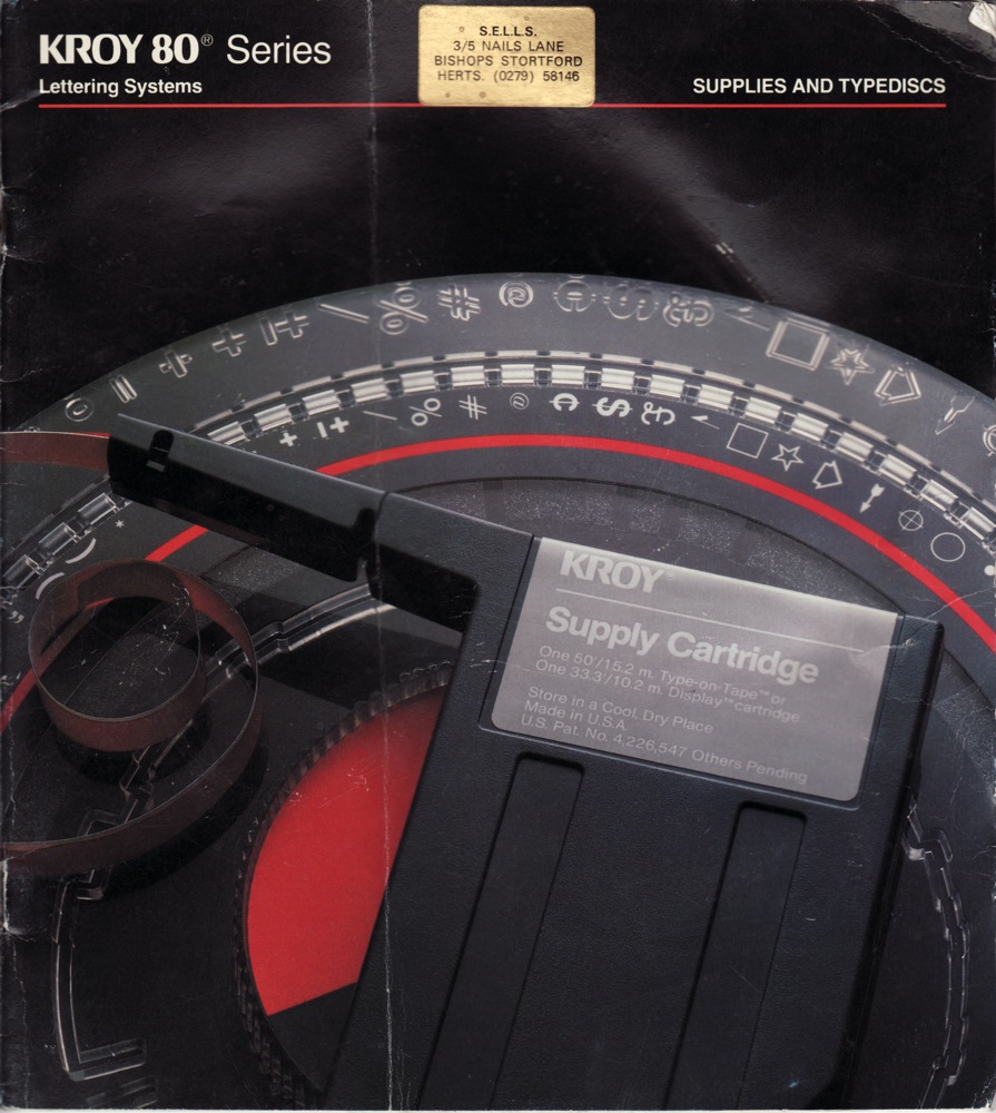
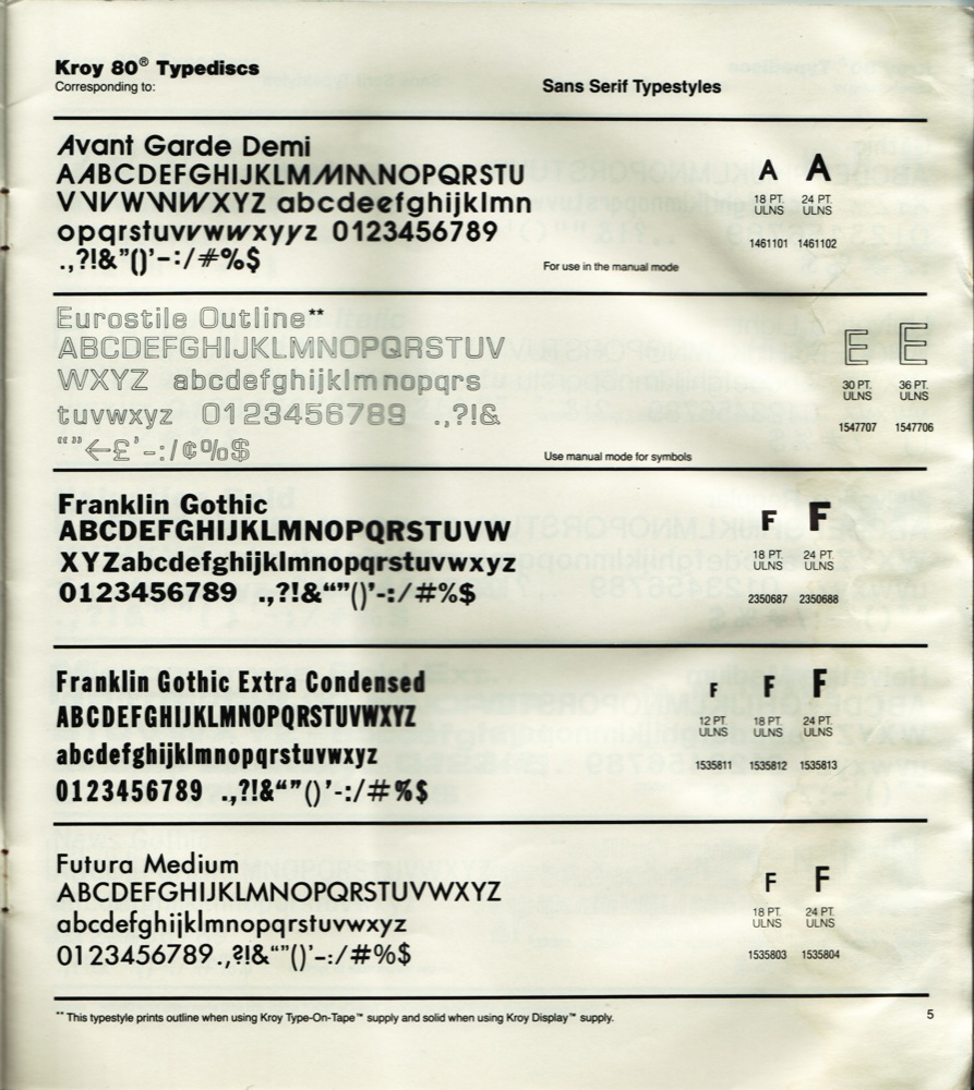
When I was a pimply 14-year-old freshman in high school who still just wanted to draw comics for a living, I joined the staff of the school newspaper hoping to contribute a bit of art now and then. One of the first things I was taught was the use of the Kroy machine, which set type on transparent strips of adhesive tape for the headlines in the paper. Among the font discs we had on hand was Avant Garde Demi, and it included a number of the alternate glyphs that actually make this design interesting. Playing with that font and that machine was the first time I thought about the visual possibilities of a certain style of letter, and how you could create something by manipulating how you arranged letters. It wasn’t an immediate conversation, but something clicked, connected to my fascination with comic book titles and sound effect balloons, and — obviously — eventually led to a lifelong fixation.

