There’s a tendency when talking about typefaces to focus on the little details. However, this is a story about the life cycle of typefaces, specifically the way typefaces have been a crucial part of the life cycle of The Times of London, a trusted brand that has carefully cultivated its use of typography for decades.
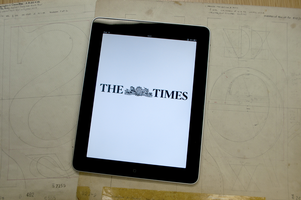
I recently gave a talk at the Click series of conferences in New York, San Francisco, and London, which were partly sponsored by my employer. My talk was about the history of custom type used by The Times of London, particularly the Times Modern family that they currently use for headlines and other display stuff in the paper and in their digital versions.
Someday there should be a video available of the version I delivered in San Francisco, but until that surfaces you can also get a more refined version of the story (including a bunch of photos I took of the The Times offices here in London) in the sleek new issue of Linotype‘s bilingual Fonts in Focus magazine, available now for just the price of postage.