Month: November 2010
Hometown
Woody
My style
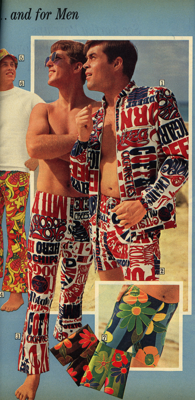
I totally want these. No lie. Especially the jacket.
Scanned from a Summer 1969 Sears catalog. Usually I hold back on the judgment and editorializing about things I post on Public Collectors but these patriotic shopping list ensembles just can’t possibly be real. No one bought those right? I refuse to believe that men were walking around on the beach looking like fucking idiots wearing red, white and blue get ups blaring such catchy slogans of the 1960s as: “MILK”, “POTATO CHIPS”, “SHRIMP”, “PIZZA” and “CHEESE.” No way. This shit did not exist. Not a single purchase was made.
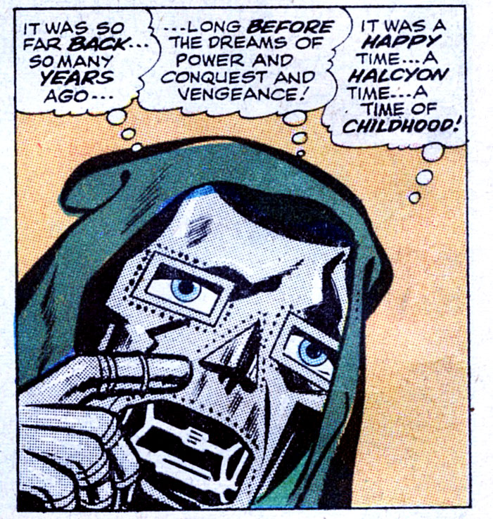
Doom!
The Everyday Experiment
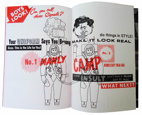
The Pink Mince astro-buddies, as featured in Andew Slatter’s journal The Everyday Experiment
Sina Evil speaks!
Check out this short but great interview with my beloved pal Sina Evil, whose illustrations were featured in Pink Mince #5 — The Louche, Limp-Wristed Lifestyle — and Pink Mini #2 — Boycrazyboy
Superstore
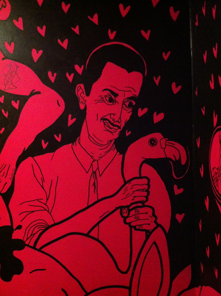
It IS Nice That

We’re in excellent company over at It’s Nice That
Times Modern and the modern Times
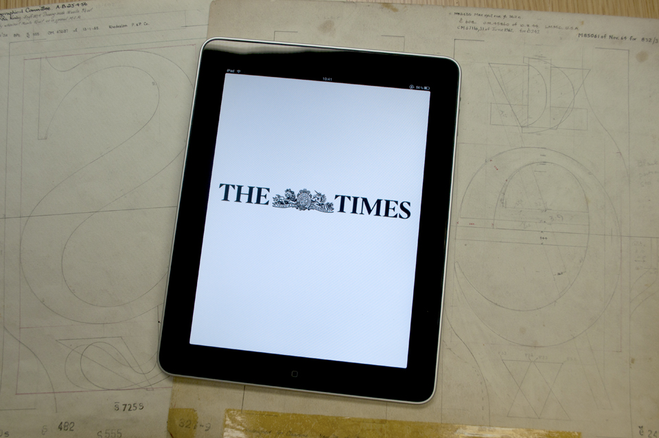
There’s a tendency when talking about typefaces to focus on the little details. However, this is a story about the life cycle of typefaces, specifically the way typefaces have been a crucial part of the life cycle of The Times of London, a trusted brand that has carefully cultivated its use of typography for decades.
I recently gave a talk at the Click series of conferences in New York, San Francisco, and London, which were partly sponsored by my employer. My talk was about the history of custom type used by The Times of London, particularly the Times Modern family that they currently use for headlines and other display stuff in the paper and in their digital versions.
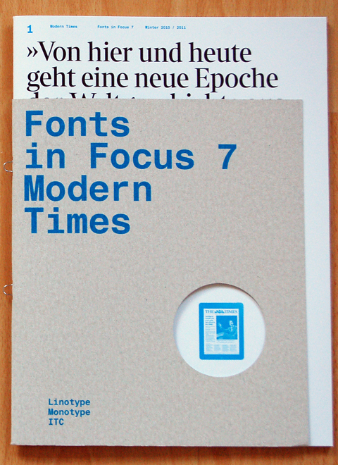
Someday there should be a video available of the version I delivered in San Francisco, but until that surfaces you can also get a more refined version of the story (including a bunch of photos I took of the The Times offices here in London) in the sleek new issue of Linotype‘s bilingual Fonts in Focus magazine, available now for just the price of postage.

