
Day: April 28, 2010
Enter the Void
One of the points I try and make when I talk about “bad” type (let’s just say it’s of dubious quality, for whatever reason) is that a good designer can do brilliant things with almost any typeface with enough imagination and care and balls. And when I say stuff like that, I envision amazing things like this (warning: may cause seizures, but that’s a small price to pay):
[The opening credits from Gaspar Noé‘s Enter The Void]
Oh Coney, My Coney
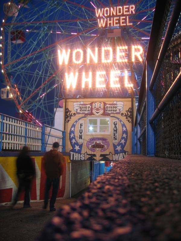
The start of Summer always makes me long for Coney Island, especially now that it’s so far away and I’ll probably never see it again before it finally gives in to all the pressure and becomes something else.

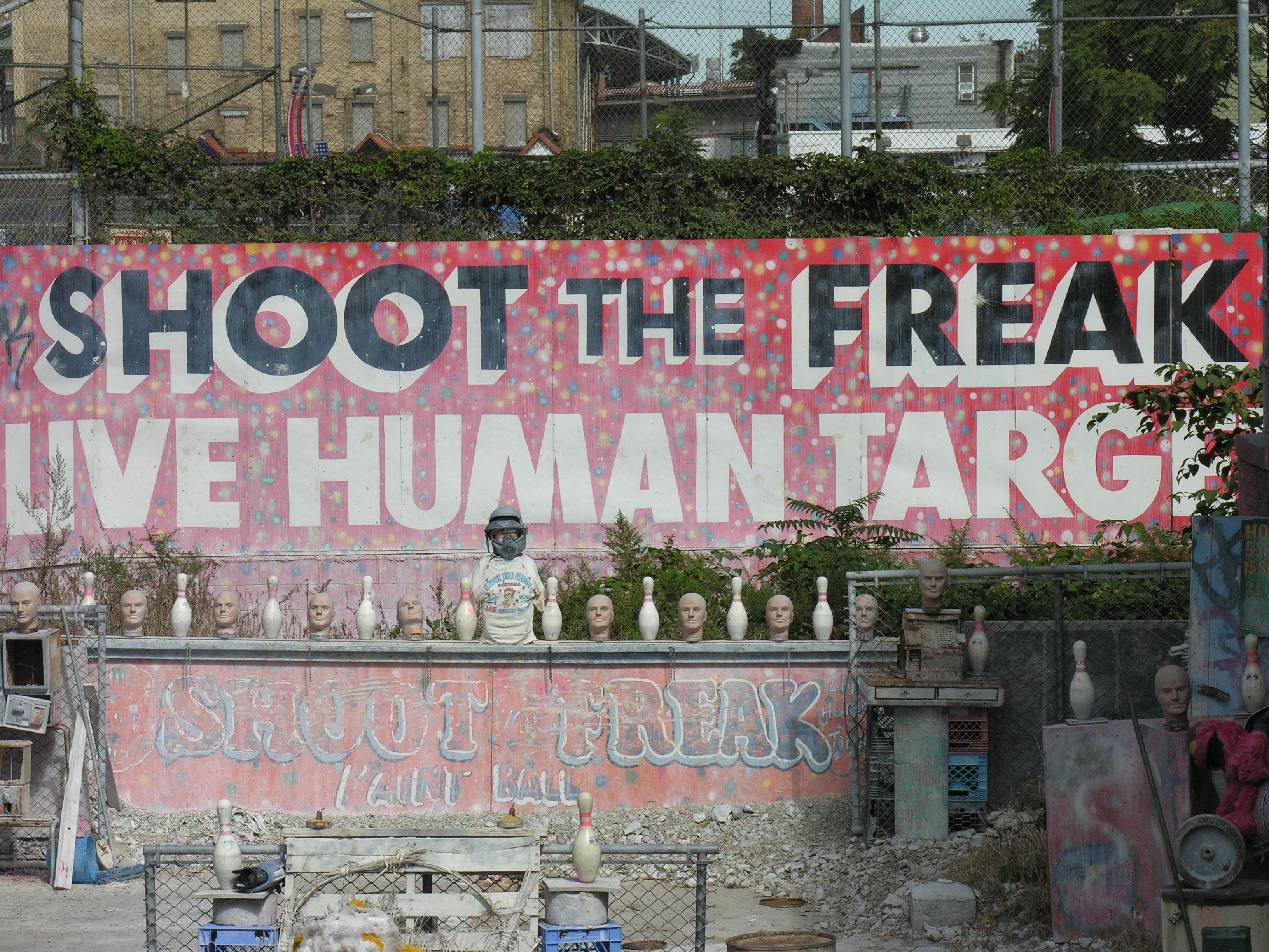
But there’s so much to love. If you haven’t been there it may be hard to see past the decay and appreciate the real charm that comes from the liveliness of the place, and the visible signs of a long, colorful history. I’ve always had trouble putting my finger on my love for the place, although it’s such a goldmine of lettering and kitsch that it’s easy to understand what first sucked me in. But it’s always been more, somehow, too.
Coney Island Dream from Joshua Brown on Vimeo.
[Coney Island Dream from Joshua Brown on Vimeo.]

