I’ve been really focused on getting things ready for a talk I gave to the design students at Central St Martins last night, because it was a whole new presentation that required me to really digest and process a lot of ideas that have been simmering on the backburner for a while. The basic point of the talk, which will surely be revised and expanded and edited and given a few more times, is that when you do research about type design — particularly design for unfamiliar writing systems — you need to be incredibly objective and open to all possibilities and examples and things you can learn from them. Maybe you don’t have enough understanding to know whether or not your sources and examples are reliable, or maybe you’re letting your personal taste be your guide — either way, you probably need to stop and step back and ask yourself if what you’re doing is relevant, appropriate, or effective. There can actually be a lot of useful lessons in things that you might easily dismiss (for plenty of good reasons) as being “bad’.
After the talk, there was a great Q&A session with the audience, and then drinks at a pub, and then dinner. It was nice, and a welcome relief from my frenzied pace of late, and very creatively stimulating on the whole to get all all those ideas out of my head and then have clever people respond to them.
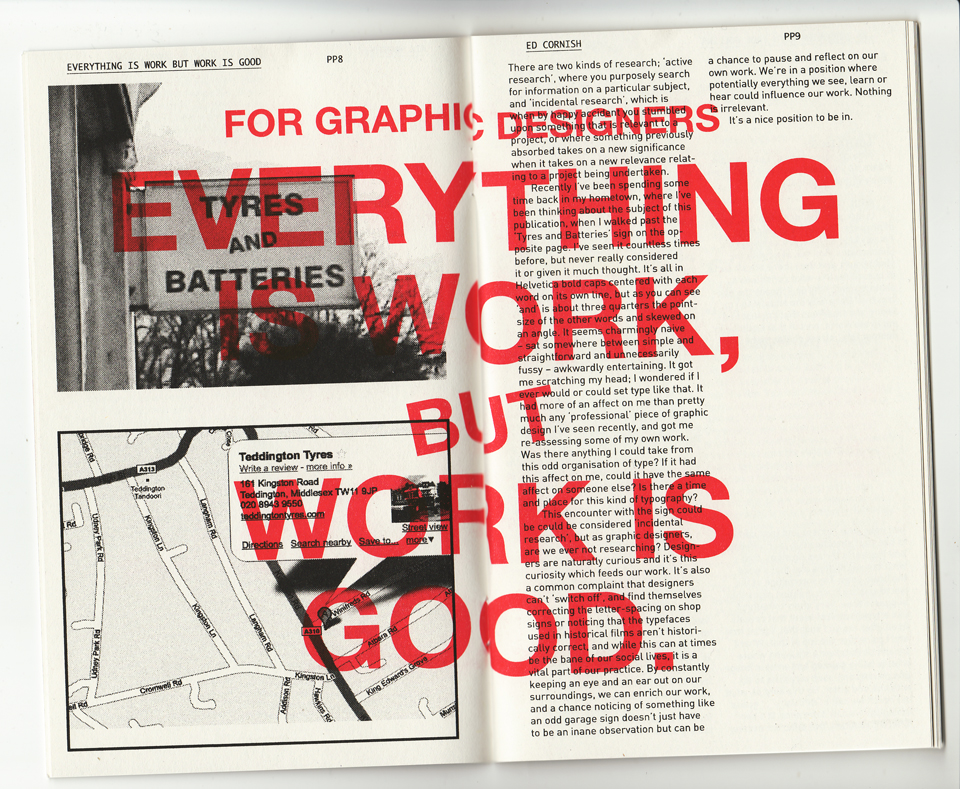
Another nice treat was this little booklet that Rathna gave, published by the CSM students she advises on a little side project called Print Matters. The booklet — printed by Hato Press on a Risograph machine, which I now desperately want — was a bunch of short reflections on practice. I was tickled to read that one of them, written by one Ed Cornish, was about stumbling across the same ideas about research in another way.

Ed’s essay, since it’s a little hard to read in that scan:
There are two kinds of research; ‘active research’, where you actively search for information on a particular subject, and ‘incidental research’, which is when you stumble upon something that happens to be relevant (a happy accident really) or where something previously absorbed or something almost forgotten takes on a new significance when it suddenly becomes relevant to project being undertaken.
Recently I’ve been spending sometime back in my hometown, where I’ve been thinking about the subject of this publication. I walked past the garage sign on the opposite page, a sign I’ve seen countless times before, but never really considered. All of it was in caps, Helvetica bold, with each word centered on a new line, but ‘and’ was about three quarters the point-size of the other two words and skewed on a slight angle. It was charmingly naive, but sat somewhere between simple and straightforward and unnecessarily fussy; awkwardly entertaining. It got me scratching my head. I wondered if I ever would or could set type like that. It had more of an affect on me than pretty much any ‘professional’ piece of graphic design I’ve seen recently, and to some extent got me re-assessing my work. In some ways this encounter with the sign could be could be considered ‘incidental research’; it’s a happy accident that I finally took notice of it while I was reflecting on my own practice, but as graphic designers, are we ever not researching? Designers are naturally curious, and it’s a common complaint that they can’t ‘switch off’, and find themselves correcting the letter-spacing on shop signs, or noticing that the typefaces used in historical films aren’t historically correct, and this is a vital part of our practice. By constantly keeping an eye and an ear out on our surroundings, we can enrich our work, and a chance noticing of something like an odd garage sign doesn’t just have to be an inane observation but can be a chance to pause and reflect on work. We’re in a position where potentially everything we see, learn or hear could influence our work. Nothing is irrelevant.
It’s a nice position to be in.


I would have loved to have seen this, maybe you can sneak me in the back door next time. You’re on fire, sir!
I originally had a section on Sodachrome, too, but it was starting to stray a little from the topic so it was ruthlessly removed. Maybe we can sneak back in together sometime and talk about quirky chromatic types for print.