I’ve been gathering and sorting images for a talk I’m giving tomorrow at Central St Martins on type design, and how looking at “bad” typefaces and awkward signage and eccentric hand-lettering can teach a type designer a lot. The basic premise is that there are good lessons in there, as long as you can stop fussing about whether it’s good and take the time to time to consider what works, despite other problems with taste or style or function.
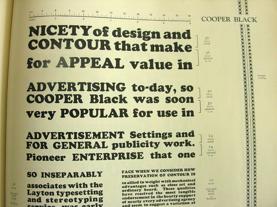
As I pull stuff together, I’ve found myself teetering on the edge of just doing an entire piece about Cooper Black and Cooper Black Italic, a pair of my all-time favorite typefaces.


It can be really difficult to appreciate how beautiful Oz Cooper’s original designs are, since these types have been so watered down, abused, and over-used for so long. If you go back to the source, you see that these are rich, warm, lively letters. Maybe not perfect for every occasion, but big and bold and inviting. It should be no surprise that they were widely used and eventually widely licensed or pirated for a variety of situations and fabrication methods.

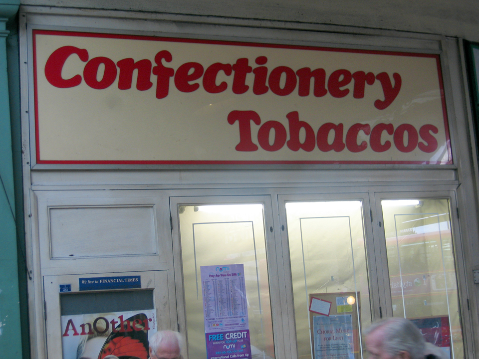
The trouble seems to come from the quality of reproduction in the may ways of adapting the design for signage, iron-on letters, labeling machines, etc. A lot of the subtlety of the outlines get lost in all this translation, and the spacing usually goes to shit, and then suddenly this friendly letter is just saying “FREE MUSTACHE RIDES” on someone’s shirt or advertising a 99¢ sale and all the charm is lost.

But it’s still there, just waiting to be used well. As much as I hate flying with EasyJet, for instance, I quite love all that orange and Cooper Black they use. And I still totally have a jones for iron-on Copper Black lettering, especially if it’s flocked.

I really should just do an Oz Cooper talk one of these days, I suppose, and just get all this out of my system once and for all.
