Before stumbling my way into design and typography while working on my high school newspaper — and discovering that I loved doing that stuf A LOT — my goal in life was to draw comics, which was how I passed quite a lot of my free time and a significant chunk of my time in math and science class before that. (Note: I wasn’t especially good at drawing comics, but I loved it.)
My desire to focus on comics as a profession gave my to a more intense interest in type, but I still dabbled with illustration for a while, and certainly my love for reading comics remained strong. As a designer, too, I’ve always been intrigued by how comics function visually, and how they have their own ways of being narrative. So when I stumble across good advice from talented comic artists, I always take note.
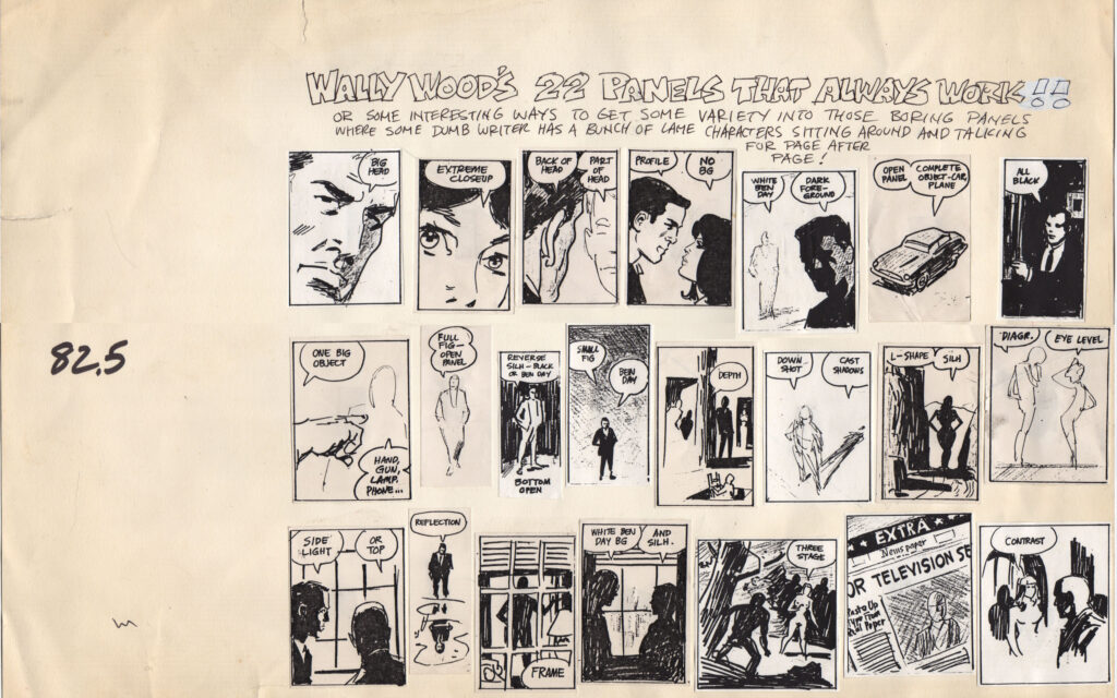
I while back I came across this piece about Wally Wood’s 22 Panels That Always Work, an incredible short guide to effective composition, drawn up by an industry veteran and apparently in unofficial circulation for years. It’s a gem. (Small version here, but you owe it yourself to check out the bigger version.)


