Hi-class operations in the ’hood

While enjoying this teeny article about the cost structure behind designer clothes that sell for seemingly unreasonable prices, a little bell went off in the back of my brain as the writer mentioned the Martin Greenfield factory, where they were making manufacturing some designer khakis that eventually sell at Bergdorf Goodman for $550. A quick search confirmed my suspicion: that’s the place across the street from my old loft in East Williamsburg, where I lived for two-and-a-half years. I knew it was one of the few buildings in the area that was still a working factory rather than a dumpy building full of artists in search of cheap space, but had no idea they were doing the high-end stuff.

Sadly, I assume that Tenochtitlan 2000, the tortilla factory around the corner, was not operating with the same profit margins.

[And wow, it’s been a long time since I looked at the online slideshow that I linked to in that old post about my place. Damn, I miss that place, even though the loft — and my life — really went to shit eventually.]

Enter the Void

One of the points I try and make when I talk about “bad” type (let’s just say it’s of dubious quality, for whatever reason) is that a good designer can do brilliant things with almost any typeface with enough imagination and care and balls. And when I say stuff like that, I envision amazing things like this (warning: may cause seizures, but that’s a small price to pay):

[The opening credits from Gaspar Noé‘s Enter The Void]

Oh Coney, My Coney

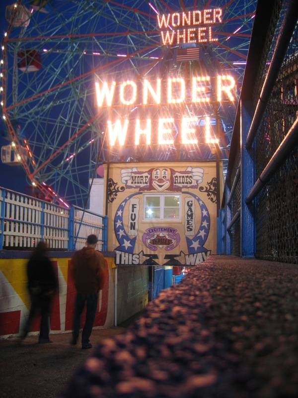
The start of Summer always makes me long for Coney Island, especially now that it’s so far away and I’ll probably never see it again before it finally gives in to all the pressure and becomes something else.

Wonder Wheel

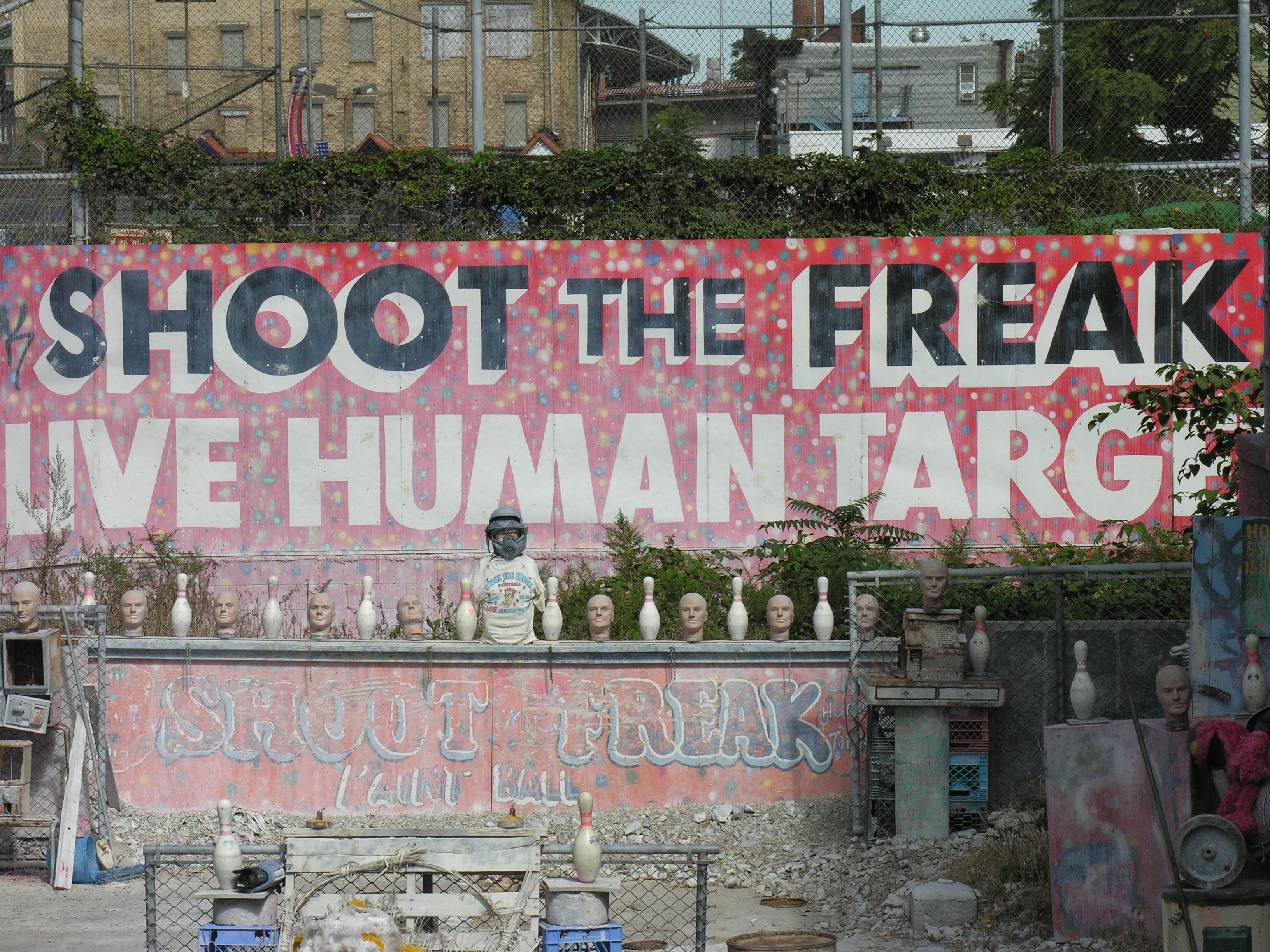
But there’s so much to love. If you haven’t been there it may be hard to see past the decay and appreciate the real charm that comes from the liveliness of the place, and the visible signs of a long, colorful history. I’ve always had trouble putting my finger on my love for the place, although it’s such a goldmine of lettering and kitsch that it’s easy to understand what first sucked me in. But it’s always been more, somehow, too.

Coney Island Dream from Joshua Brown on Vimeo.

[Coney Island Dream from Joshua Brown on Vimeo.]

Shoot the Freak

Let me pass

passport photos

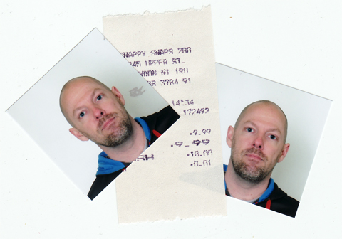
New passport photos, at last all sorted. Hilariously, there’s a place down the street form the studio that does them. Well, it wouldn’t have helped to get them last week since I’m still waiting for a paycheck deposit so I can end in the fees for the new passport anyway. And then I just start hoping this all gets fixed before I have to fly to the Netherlands to teach at the end of May.

Oh, and don’t get even GET ME STARTED on the headaches that are going to be involved with securing a visa renewal by December. I’m going to be nagging a lot of people all summer long if that shit’s going to happen.

Don’t be a snob

I’ve been really focused on getting things ready for a talk I gave to the design students at Central St Martins last night, because it was a whole new presentation that required me to really digest and process a lot of ideas that have been simmering on the backburner for a while. The basic point of the talk, which will surely be revised and expanded and edited and given a few more times, is that when you do research about type design — particularly design for unfamiliar writing systems — you need to be incredibly objective and open to all possibilities and examples and things you can learn from them. Maybe you don’t have enough understanding to know whether or not your sources and examples are reliable, or maybe you’re letting your personal taste be your guide — either way, you probably need to stop and step back and ask yourself if what you’re doing is relevant, appropriate, or effective. There can actually be a lot of useful lessons in things that you might easily dismiss (for plenty of good reasons) as being “bad’.

After the talk, there was a great Q&A session with the audience, and then drinks at a pub, and then dinner. It was nice, and a welcome relief from my frenzied pace of late, and very creatively stimulating on the whole to get all all those ideas out of my head and then have clever people respond to them.

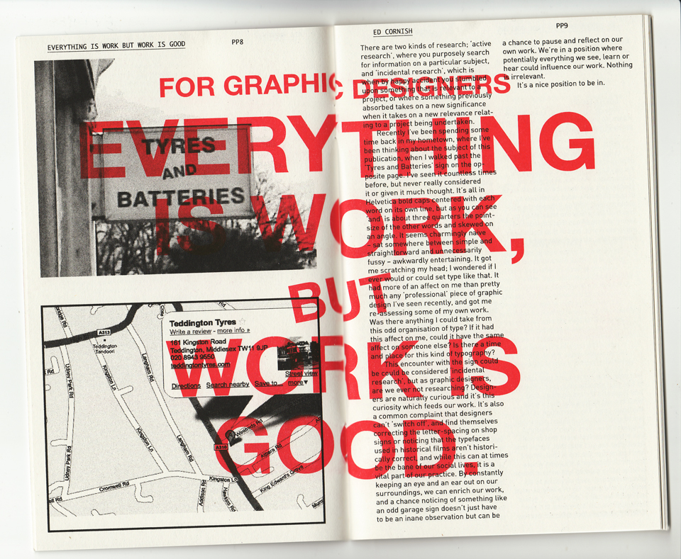
Another nice treat was this little booklet that Rathna gave, published by the CSM students she advises on a little side project called Print Matters. The booklet — printed by Hato Press on a Risograph machine, which I now desperately want — was a bunch of short reflections on practice. I was tickled to read that one of them, written by one Ed Cornish, was about stumbling across the same ideas about research in another way.

Print Matters

Continue reading “Don’t be a snob”

The Art of Working Together

I wanted to draw special attention to Jonathan Hoefler‘s remarks about collaborative typeface design from this Typophile thread, because they are wise, and they give credit where it’s due, and because they paint such a clear picture of the kinds of things I love so much about getting to team up with smart, creative people on cool projects whenever I can. (Hi, Ian! Hi, Rathna! Hi, Matt!)

Continue reading “The Art of Working Together”

The Land of Oz

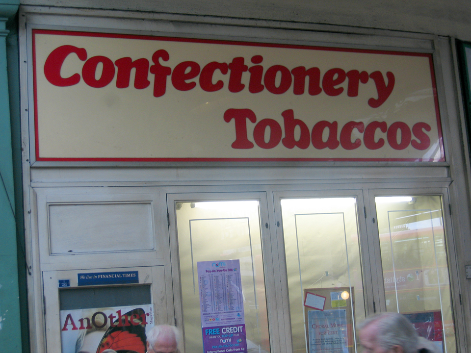
I’ve been gathering and sorting images for a talk I’m giving tomorrow at Central St Martins on type design, and how looking at “bad” typefaces and awkward signage and eccentric hand-lettering can teach a type designer a lot. The basic premise is that there are good lessons in there, as long as you can stop fussing about whether it’s good and take the time to time to consider what works, despite other problems with taste or style or function.

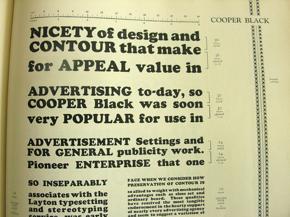
As I pull stuff together, I’ve found myself teetering on the edge of just doing an entire piece about Cooper Black and Cooper Black Italic, a pair of my all-time favorite typefaces.

It can be really difficult to appreciate how beautiful Oz Cooper’s original designs are, since these types have been so watered down, abused, and over-used for so long. If you go back to the source, you see that these are rich, warm, lively letters. Maybe not perfect for every occasion, but big and bold and inviting. It should be no surprise that they were widely used and eventually widely licensed or pirated for a variety of situations and fabrication methods.

The trouble seems to come from the quality of reproduction in the may ways of adapting the design for signage, iron-on letters, labeling machines, etc. A lot of the subtlety of the outlines get lost in all this translation, and the spacing usually goes to shit, and then suddenly this friendly letter is just saying “FREE MUSTACHE RIDES” on someone’s shirt or advertising a 99¢ sale and all the charm is lost.

But it’s still there, just waiting to be used well. As much as I hate flying with EasyJet, for instance, I quite love all that orange and Cooper Black they use. And I still totally have a jones for iron-on Copper Black lettering, especially if it’s flocked.

I really should just do an Oz Cooper talk one of these days, I suppose, and just get all this out of my system once and for all.

Bitch, please

You’ll have to pardon the whining, but sometimes a guy just needs to let it all out, OK? Here, in no particular order, is a brief list of bad things that happened yesterday:

  • Woke up to an email informing me that a collection agency that is annoyed about my insolvency is escalating things to the lawyer level. (Thanks, freelance clients who didn’t pay invoices for months at a time while I was looking for steady work.)
  • Left my US checkbook at home so I couldn’t throw a sacrificial pittance at them to get them off my back for now.
  • Did not wake up to discover that large fees for other freelance work had finally been deposited in my bank account
  • The new glasses I ordered last week did not show up at the optician, like they were supposed to, so I’m still stuck wearing the old pair held together by messy gobs of Krazy Glue.
  • The optometrist checking the fit of my contacts informed me I have crusty eyelashes.
  • Fontlab crashed a bunch of times, but that’s a daily occurrence.
  • I finally did my taxes, even though I was pretty sure I didn’t have enough money to pay them. (I don’t, because of those invoices that haven’t been paid yet.)
  • But I couldn’t even finish preparing my return because TurboTax refused to let me enter credit card information that’s not tied to a US address.
  • I got a photo for my emergency new passport, but it’s not the size that the US requires, so I have to run around and find another place that takes a proper set instead of using one of the stupid booths.
  • I already whined about how I have to have my passport replaced, but that’s still making me mad.
  • I was finally informed that the mysterious kidney problem that my doctor has been trying to identify is acute interstitial nephritis. I can’t feel anything going wrong, but apparently it can become suddenly life-threatening.
  • That means I have to switch from my regular meds (which always leads to days of feeling shitty), and take a ridiculously huge stack of other ones to deal with the kidney thing and then manage all the side effects that are likely to happen.
  • I will probably be suffering from severe indigestion, weight gain, and acne for the next few weeks, as if I wasn’t self-conscious enough already.
  • Got stressed about today’s deadline for an ATypI proposal, an indefinite but urgent deadline for stuff I have to write about another ATypI thing, the presentation I’m giving CSM next week, a regular client’s ongoing needs which they never plan far enough in advance and hence are always rush jobs, and the massive family if Indic typefaces I’m still trying to finish for my full-time job (the success of which will determine if I get another job by the time my visa runs out).
  • My Gujarati is not progressing well, and that pissed me off.
  • There was probably some other shit that went wrong, too, but I can’t remember it now. It was a really bad day.

Thankfully, Ian made me a nice cuppa tea and some dinner while we had a productive, encouraging chat about upcoming projects for The Colour Grey, so really helped me relax before I came home and fell asleep. (And sleep is good because that’ss when things go away for a few hours and I like that.)