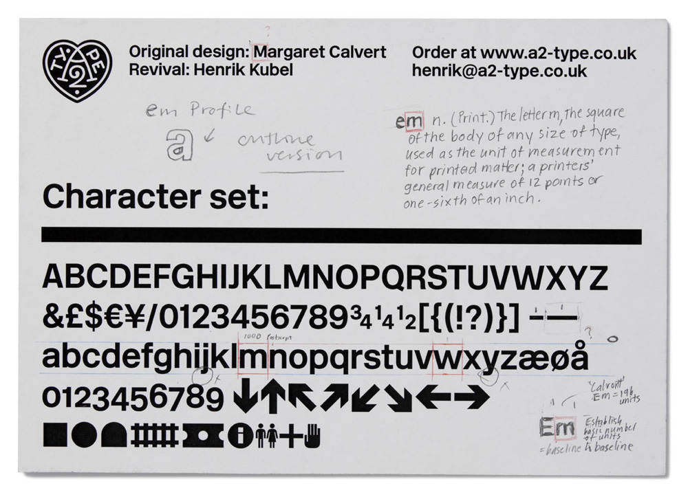
Available at last! Margaret Calvert and Henrik Kubel have released the New Rail Alphabet, their gorgeous revival of Calvert’s classic design for British hospitals and transport networks in the 60s. As you can see, it’s like a Helvetica, but with a touch more warmth to it.
There was a feature about the design in the latest issue of Eye magazine, in which the new typeface was called Britanica, but there were some lawyer-y concerns, and they finally decided to go with something a bit closer to the original name.
