I may have hinted at this before, but for a chunk of the last year, I have been collaborating with my good friend and fellow MATD alumnus Ian Moore on some type and graphic design projects. Need some bespoke type solutions for identities or publications, or help developing some lettering into a full typeface? Perhaps you could use the help of The Colour Grey.
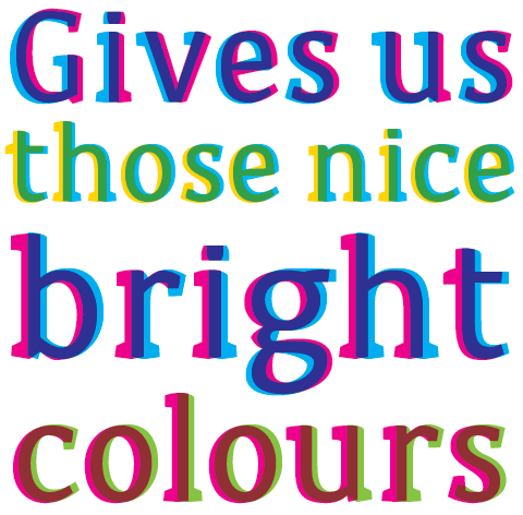
Last Spring we were talking about what kind of work we’d like to do if we partnered up, and fantasized about landing a project that would let us experiment with unusual type solutions that could push the boundaries of how the type could be used, and even go beyond two dimensions in some way. In an almost alarming coincidence, the next day my friend Rathna asked if I’d liked to develop an typographic identity for an online shop selling products that celebrated the quirks and imperfections that are part of hand-crafted production. She wanted a typeface that would benefit from these surprises, especially with the inprecise nature of screenprinting. Bingo! Before we even had a name for ourselves, we had a great project. Months later, the shop is almost ready to go, and we are please to tease you with a peek at Sodachrome:
We liked the idea of creating a new chromatic typeface consisting of two colored shapes overprinting to create a complete character. This developed into overlaying two separate quirky fonts to create the illusion of a sans serif in the middle and a playful, chunky serif on the outside.

As shown above, when (1) and (3) are overprinted with semi-opaque inks, (2) is the result. When printed with one solid colour, (4) is the result, and (6) shows the sans extracted from the overlap of the two shapes.

When designing each character, we explored interesting ways to combine the two overlapping shapes. The rules were frequently subverted, but we were careful to maintain a consistent feel to the typeface. It was a particularly good problem to tackle with two of us working on the project, since we could each brainstorm a few glyphs and pass it off to the other for comment and critique, incorporating and refining the different shape combinations as we went along.

During screenprinting, the two screens don’t always align precisely, so we looked at how the typeface would be affected under these conditions by deliberately shifting the layers to see how the characters would survive. Rathna works with a screen printer in India to produce the products and artwork that will be sold, so she was able to coordinate some printing tests with the inks and paper that would be used, allowing us to examine the registration tolerances and see how the inks would combine physically instead of just on screen.

For the next year, Sodachrome will be used exclusively by Rathna for her online shop (coming soon, we swear) — for its identity as well as for some of the items that will be sold. Meanwhile, we’ll be refining the design and expanding the family a bit so we can begin selling it, along with some other stuff we’ve been tinkering with at the same time.
Wish us luck! We hope that more great chances like this will come our way.


Nice work!
I have also began a layered design… but this is a cool approach.
Quite different!
Good luck with the next projects too 🙂
yeah! i am so happy for you!
sweet! that is really fun & easy to read.
I’m thrilled how fantastic it worked out!
Yes indeed, what a fantastic work! I cannot wait to see your next project 🙂 Good luck!