I may have hinted at this before, but for a chunk of the last year, I have been collaborating with my good friend and fellow MATD alumnus Ian Moore on some type and graphic design projects. Need some bespoke type solutions for identities or publications, or help developing some lettering into a full typeface? Perhaps you could use the help of The Colour Grey.
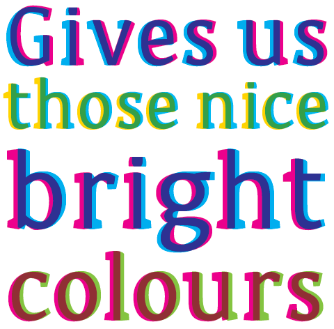
Last Spring we were talking about what kind of work we’d like to do if we partnered up, and fantasized about landing a project that would let us experiment with unusual type solutions that could push the boundaries of how the type could be used, and even go beyond two dimensions in some way. In an almost alarming coincidence, the next day my friend Rathna asked if I’d liked to develop an typographic identity for an online shop selling products that celebrated the quirks and imperfections that are part of hand-crafted production. She wanted a typeface that would benefit from these surprises, especially with the inprecise nature of screenprinting. Bingo! Before we even had a name for ourselves, we had a great project. Months later, the shop is almost ready to go, and we are please to tease you with a peek at Sodachrome:

Continue reading “The Colour Grey, revealed”


