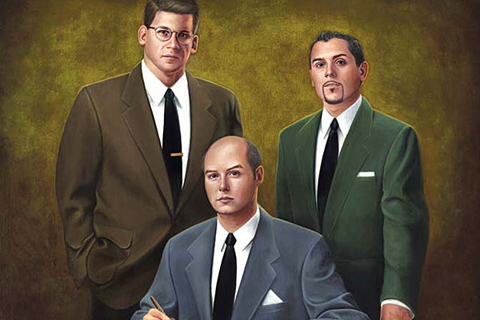
I’m a big fan of House Industries, not just as designers and fellow pop-culture enthusiasts, but also as a bunch of really good-natured, fun, talented guys. It pains me regularly that they release all these zesty, beautifully crafted typefaces that I rarely get a chance to use. Luckily, they also make the best schwag in the business, effectively building something of a lifestyle brand based around their typefaces. This Fast Company article about them is a nice little profile, in case you don’t know much about who they are. (And shame on you if you don’t.)
Month: September 2008
Candy store
Most of my medical stuff happens at the sexual health clinic rather than a GP’s office, so the vibe in the waiting room is always a little weird. In the town where I used to live, this meant there were lots of nervous college kids, sketchy guys, and kinda trashy girls. There are lots averted eyes and people actively trying to state at the telly instead of anything else.
In the middle of London, however, this means that everyone is almost eerily hot, and mostly gay — including the staff. It’s hard to ignore the distinctly cruisy vibe in the room. Even if folks aren’t actively cruising, they’re definitely inspecting everyone else. It’s a totally different kind of awkward, much more like my doctor’s office back in Chelsea in New York.
Is there a socially acceptable way to ask someone out at the clap clinic?
A font walks into a bar
Believe it or not, corny jokes about typefaces are the kind of thing that are usually too geeky even for me. Nevertheless, I feel like I ought to just post something about this now before every other person in the universe starts sending me links to it, like they did with the font conference video. (I appreciate the thought, by the way. Don’t get me wrong.) So here you go: Typographunnies. [Thanks, Brad.]
Papa, can you hear me?
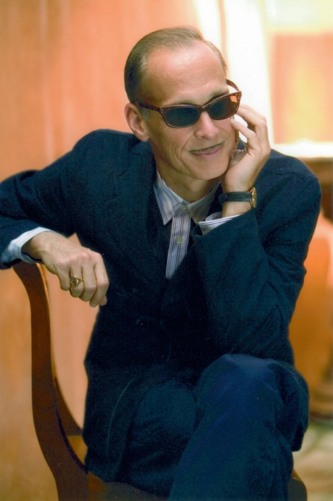
I’m sick as all get-out this week, with some sort of chesty, fever- thing going on. Hopefully, though, Thursday night‘s audience with the Pope of Trash will be the miracle cure for my ailment.
Judge not lest ye be judged
This is a snippet from a fascinating little documentary called Dressing for Pleasure by John Sampson. (Unfortunately the site that used to host the whole thing has shut down, and this is all I can find at the moment.) I totally lack the energy to combine this barrage of related links into a proper post right now, so just think of this as sort of a pervy brain dump:
These go to 11
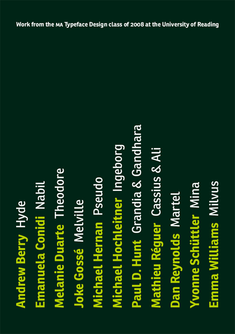
Rejoice! The MA Type Design program at Reading has just unleashed a new batch of gorgeous, freshly minted typefaces! Behold!
I’ve had a real blast getting to know these guys during the past year, but since I wasn’t actually there in the studio with them all year I only had the barest notion of where everyone was going with their designs, and then I had already moved to London by the time everyone began the final frenzy of completing their fonts. It’s so exciting to see what great types they finally produced. Congratulations, gang!
Typography for Lawyers
Once you start thinking about typography, you begin to realize that it affects everyone to some degree or another: it’s not just the preoccupation of the font nerds in your life. (Just ask any of the many people I’ve turned to the Dark Side over the years. Once you start thinking about kerning there’s no return.) Typography is an integral part of communicating, and people often need to communicate. It’s nice, then, when people who get it take the time to explain its relevance in their own field. Case in point: Typography for Lawyers, written by lawyer and former type designer Matthew Butterick.
The few comments on the site so far are hilariously detail-oriented and pedantic, which you might expect from a project aimed at lawyers and typographers.
Edwardian masher
While I’m on this Joe Orton kick, here’s another great bit from the diaries:
Saturday 15 April
Watched Doctor Who on television. Rubbish, but there’s a young boy in it who’s worth looking at; like an Edwardian masher at a Gaiety show, I mentally undress him. I’m sure the BBC would horrified if they realised that even a science fiction series can be used erotically.
Judging from the date, I’m assuming that the episode in question was part of “The Faceless Ones“, and that the alluring lad in question was probably young sailor Ben Jackson, played by Michael Craze.
“Edwardian masher at a Gaiety show” is my new favorite phrase, by the way. And though Orton is a good enough writer for that quip to feel very off the cuff, it’s actually the one instance in his diaries where I spotted him re-using an earlier joke. On the 24th of January, 1967, Orton paid a visit to meet Paul McCartney and Brian Epstein to talk about writing a script for the next Beatles movie. During the course of the evening, a pop group called the Easybeats drop by, about whom he says:
…about five very young and pretty boys trooped in. I rather hoped this was the evening’s entertainments. It wasn’t, though. …After a while we went downstairs. The Easybeats still there. The girl went away. I talked to the leading Easybeat. Feeling slightly like an Edwardian masher with a Gaiety Girl.
Singin’ for your supper
Bette Davis pulled a neat trick when she took on the title role of Whatever Happened to Baby Jane?, managing to revive (and in some sense, reinvent) her career at an age when most leading ladies were left with no place in Hollywood. I knew that she worked hard to get the role, and worked hard to get it right (that kind of scenery-chewing doesn’t come easy), but I had no idea she went to such great lengths to promote the movie:
Poor dear. The spectacle of her performance in the movie was intentional, and quite briliant. This just makes me wince. You can almost see her gritting her teeth and thinking, “focus on the paycheck, focus on the paycheck”.
[Thanks to Café Muscato for digging up this gem.]
Badger
If you think you would enjoy an extremely cute but sad tale of a lonely badger living in a flat in South London (and really, how could you not enjoy it?), then you should buy a copy of Howard Hardiman‘s Badger. It’s really charming, I promise.
[Shameless self-promotional alert: I helped Howard put the final product together, since I’m such a fan of the badger. The book also features a little bit of a little typeface I designed.]


