
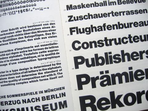
I finally had a chance to watch the outtakes from Helvetica (the documentary that any and all type and/or graphic designers know about, but the rest of you may or may not know about), and I was pleasantly surprised.
The surprise was not that I enjoyed the film and the extra footage. When I first saw Helvetica last summer I really enjoyed it, and thought it might be the best way to actually make other people understand what I do and why I often feel so passionate about typography and design. It tells the story of Helvetica in a clear way that connects this one typeface — and the importance of typefaces in general — to the whole environment of printed, manufactured, and broadcast stuff that’s around us all the time. When I was back in New York for Christmas, I wished I had a DVD of the film with me so I could show my family and give them a better idea of what I’ve been up to since I left the country.
The extra footage on the DVD was rightfully left out of the film itself. Much of it ventures off into other territory about type and design in a way that would water down the story of Helvetica itself. It’s all really fascinating, though, for people who have more of an interest in design. All the interview outtakes from people like Matthew Carter, Massimo Vignelli, Neville Brody, and even David Carson (I’m over him, but I still remember what a shot of vitality his work once was) are a rich source of information about design process — the way different designers work and think. They shed some light on an aspect on what we do that’s often obscured by people just paying attention to the end results alone, and it’s a treat to have this kind of off-the-cuff talk available somewhere other than the more exclusive realm of a professional conference or lecture, or the more formal realm of published work.
If you’re curious enough to check it out, Netflix has it now, or you could always throw a little support the filmmaker’s way and buy yourself a copy.