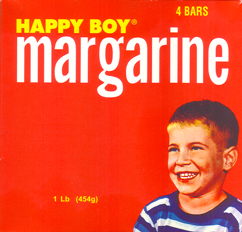
I don’t even know where to begin. Should I talk about the photo (wretched but intriguing, like a Stepford kid), the typography (strangely modernistic for a product with that down-to-earth feel), or the very notion that a package like this is supposed to entice someone to buy a cheap and greasy butter substitute? You be the judge. My mind is already reeling.

the old bodega down my street actually SOLD that butter in the packaging just a few years ago.
to my mind the typeface is actually selling “Happy Boy Migraine” medication. just sayin.
That’s just wishful thinking, because the background color is causing such extreme sensory discomfort.
I like to think that he has just eaten 4 whole bars. What else could bring such joy to his face?