Busted

Friends, don’t let this happen to you:Publisher in £80,000 font raid”

A publishing firm fell foul of the law by using unlicensed typefaces worth £80,000, according to licensing lobby group the Business Software Alliance (BSA).

The publishing firm had claimed to be using just one font but in fact was found using 11,000.

There is, naturally, a maddening Slashdot discussion about this where all kinds of justifications for piracy are tossed around, but it think it comes down to a few key points for me (and I freely admit my personal bias when it comes to people doing the right thing and paying for software and typefaces):

  • That piracy is illegal, yo, even if you think the stuff should be free.
  • And if you’re making money using your pirated wares? Tsk, tsk — suck it up, and take the tax deduction as a consolation prize.
  • Your piracy is part of the reason software is so damn expensive, anyway, so quit making it harder for the rest of us to do the right thing.
  • Also, people are trying to earn their livelihood by making that stuff (and I will probably be one of them soon), in case your moral reasoning requires a human face to make you realize it’s theft.

Now, I know it’s hard. I was, in the days of my youth, an unspeakably shameless software and font pirate. But I found it to be very ethically murky territory after a while, not to mention the whole “illegal” thing. I now own valid licenses for the software I use, but it’s still challenging to restrict type usage to the ones I’ve actually paid for. (And that’s coming from someone who has spent a small fortune on properly licensed typefaces.) I pay for all the type I use for freelance projects (since if my business is making with them, then the foundry should get their fair share), and I’ve been weening myself off the illegal copies, slowly but surely.

It’s hard, because even though there are lots of free fonts out there, most of them are shockingly craptacular. Others are sketchy copies of other fonts, which is still bad form, even if the legality technically toes the line. (The short version: you can’t copyright type designs in the U.S., but individual fonts are software, which can be copyrighted.) There are some decent options out there, such as some of the ones found on here, but even with those the usage is often limited to stuff where you’re not making money off of someone else’s hard work.

So be a good sport and buy a typeface today. Someone, somewhere could probably use the royalty check.

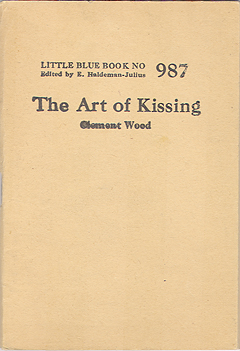
The Art of Kissing

The Art of Kissing, Part 2This charming little booklet was published by the Haldeman-Julius Company of Girard, Kansas. The put out all sorts of teeny newsprint screeds like this, sadly undated. This particular edition is mostly sweet, occasionally tongue-in-cheek (pun intended, I confess), and occasionally exactly what you’d expect from something of a certain era…

It has nothing to do with this doozy of the same title, even though they share an equally sophisticated point of view on the subject matter.


Continue reading “The Art of Kissing”

The Original Boy Butter

Happy Boy Margarine

I don’t even know where to begin. Should I talk about the photo (wretched but intriguing, like a Stepford kid), the typography (strangely modernistic for a product with that down-to-earth feel), or the very notion that a package like this is supposed to entice someone to buy a cheap and greasy butter substitute? You be the judge. My mind is already reeling.

Modern Typography, Part I

I finished Kinross’ Modern Typography last week, but it will take a while (and probably a few subsequent readings of things in it) before I really digest all of it. It might be the most lucid examination of the whole notion of “Modernism” I’ve ever read, because it views it not as a stylistic period, but as a fundamental change in the way things were done that naturally influenced the end results. From this perspective, the whole history of movable type in the West is a result of modernism, and so the book examines the layers of causes and reactions and counter-reactions that are all a part of Modernism in some way or another.

Note to self: Pick up Natalia Ilyin’s Chasing the Perfect one of these days. She seems to have similar ideas about opening up the definition of Modernism and modernity.

Kinross, Robin, Modern Typography. London, Hyphen Press, 1992

Ugly-Ass Math

Although I’m open to serendipity (or pragmatism) when it comes to choosing a thesis topic for next year, I’m leaning very heavily in the direction of working out a type family with closely integrated Greeks and math characters.

It’s a topic that’s been particularly prominent in my thoughts for years, since my job has involved lots (lots!) of work integrating math and other technical notation into text for engineering books. My hands have been largely tied when it comes to making real improvements, since the publisher has been so resistant to substantive changes, but it’s given me lots of time to analyze the problems:

  • Bad typeface choices, especially considering the poor quality of printing used, the increasing distribution via PDF of the books, and the tendency for pages to get photocopied again and again. I’ve certainly spent a lot of time trying to figure out exactly what design qualities a typeface needs to function under these conditions.

  • If you’re going to use a typeface for math, you need glyphs that will be completely legible at very small sizes, sometimes below the proportions used for normal superiors and inferiors. This would also apply to the Greeks and symbols.

  • Greek fonts present all kinds of problems. Even when you get a Greek font that works well enough on its own, the Latinization of the design tends to make it difficult to distinguish some of the individual characters (Α, Β, Κ, et al.) from the normal Latin ones around them. This happens a lot in math, where Greek characters are used in the midst of a dizzying array of other glyphs. The reader is often expected to distinguish Greeks either from their context, the slight design discrepancies between the Greek typeface and the regular text face (since they rarely match), or the use of artificial obliquing applied to the Greek characters. A total disaster.

  • Math fonts are a total mess. Since they’re always designed separately from text fonts, they don’t integrate in any way when it comes to proportions, stroke widths, overall color, etc. Plus, I have yet to encounter a family of math fonts that supports the full set of Unicode positions for math and technical characters. When they do, they often include a number of poorly documented alternate characters. (I’ve spent a lot of time lately mapping the characters in old PostScript math fonts to their Unicode positions. It’s awful.)

So, there are a few key elements that lend themselves to a meaty solution: a Latin face that’s clear and robust enough to withstand low quality display and reproduction, a really full assortment of glyphs to be used at small sizes, Greeks that are designed to be easily distinguished from the Latins instead of designed to match, and a full set of Unicode-ready math and technical symbols designed to integrate with the basic text.

I know: sounds like a huge undertaking, right? Maybe I can save it for a PhD instead.

The need for someone to do this well is really clear, though, if you look at what’s out there. The available options are an unsatisfying assortment of incomplete character sets and poor design. A consortium of publishers is working on the STIX Project, whose goal is to build a set of fonts that will include the full Unicode character sets for Latin, Greek, math, and symbols, but it doesn’t look like they’re going to release OpenType versions. Also, judging from the existing work from the company designing the fonts, the quality of the type design is still going to be problematic. Although I’m all for the work the STIX Project is doing (“preparation of a comprehensive set of fonts that serve the scientific and engineering community in the process from manuscript creation through final publication”), I cringe at the thought of their low-quality, free fonts being the only option out there (“the STIX fonts will be made available, under royalty-free license, to anyone, including publishers, software developers, scientists, students, and the general public”), since they will really result in even lower standards for technical publishing.