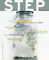
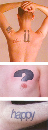
 If you check out the January/February issue of (the not great but not completely terrible) Step Inside Design magazine, you’ll find a short article about typographic tattoos featuring such luminaries as me (with the most ink, in journalism terms) and Dan’l (who inspired the author when she spotted his “happy” tattoo on the bus one day). It’s a nice little article, but now I find myself reflexively cringing at the thought of being part of a burgeoning trend.
I wish there more photos included with the article, because some of the other tattoos described sound truly exquisite. The last time I talked to the writer she was contemplating a book on the subject, so maybe I’ll get to see some of them eventually. If that happens, though, I’m going to have to make damn sure that I can offer something better than a low-res JPG for them to use. Not only does my picture in the article show all the signs of being blown up from a smaller version, but it still manages to show all the freckles and acne scars on my back. I’d hang my head in shame, but that would only draw attention to my back.
 Here’s a brief excerpt:
“What’s new here is the graphic sophistication and awareness of tattoo design: Both the tattooed and those tattooing them are responding to trends in a visually driven culture. Patrons of tattoo parlors, especially in urban areas, often come in with predesigned messages, printed out from the fonts on their computers. And the younger, hipper tattoo artists are often design school grads, with a broad knowledge of typographic choices.”
I’ve been getting the itch to add another tattooed letter to my set, too. Although I have a loose waiting list of candidates, I keep waiting for serendipity to drop something truly outstanding in my lap. So here’s what I’m thinking: why don’t some of you send in suggestions? Maybe a little collaboration is order this time around/
Send me a picture of a letter you like. Here are some guidelines to keep in mind:
- Single letters only no words
- Don’t think about the whole typeface. Take a look at individual letterforms and consider them as images all by themselves.
- I’ve been conservative about color so far, but I’m open to suggestion.
- 3-D designs would be fun, as would interesting handwritten forms. The sky’s the limit, though: surprise me.
