Please visit the active Ultrasparky blog to browse the for the content that has accumulated since this all began in 1996.
April 2008
Oh Guardian, my Guardian
Just this past weekend I was saying how much I wished the Guardian family designed by Paul Barnes and Christian Schwartz was done with its exclusive contract with the Guardian and available to other people. Lo and behold, the time has come already. Yay!

That is, "Yay! I can imagine using them now," but I doubt I have any projects coming up that could justify the cost of buying a massive type family, no matter how pretty and awesome it is. It will be interesting is to see how designers work with the Guardian family and make it the projects look like something other than the Guardian.

Today's mission is to hunt around and see who's actually selling it, and then invent ways to justify paying for a license.
Language barrier
I don't think I will ever live here long enough to be able to say "mate" in a way that sounds at all natural. It just doesn't come naturally in American English, like "pal" or "buddy". My reflex is to think of "mate" as a zoological term, as in, "In the mixed groups of savanna baboons, each male can mate with any female."
Likewise, I don't see myself adapting to the use of "nought", "whilst", "banger", "bollocks", "snog", or "shag" in the kind of reflexive way you need to make them work. And there's just no point in trying to use "arse," because it only works with the accent. (Brits, you'd sound just as silly if you said "ass", trust me.) And I definitely can't use "bloody" with a straight face, unless I’m talking about a horrible accident.
I’m fine with "bin", "flat", "prawn", "dodgy", "queue", "hash" (#), and referring to things like "half seven" instead of "seven-thirty". I also have no trouble with the British notion of "pudding" and "biscuits" compared to ours.
I’m getting better and better with "trousers," "quid", "maths", "zed", "chips", and "cheers", but it's an ongoing struggle. I can refer to "rocket", "coriander", and "courgette" without thinking about them, but I do have to regularly remind myself that I’m actually talking about arugula, cilantro, and zucchini. "Bloke" is OK, because I get that it's often referring to a certain kind of guy. I’m working on "blimey" and "crikey" because I like the sound of them, but handling of them is tinged with knowing it's not quite natural, like when I use "golly" back in America.
Undervalued much?
Here's one for the type designers out there, especially those of you who've dipped your toes into the murky depths of non-Latin typefaces:
The project is for outputing a variant Typeface from an existing open source Typeface, where the variant is replacing only 1 alphabet (upper,lower case, basic and italic) and putting a sanskrit alphabet (upper, lower case, basic and italic) that will have to be designed. . . . The budget is about $100 via Paypal, Moneybookers. Delivery for early/mid-next week.
Yeah, that’s not really how things work, my friend.
The rest of the request, and one of many appropriate answers to it is here, at Design Rants.
Update: Hmmmm, it's all even weirder than I thought.
Glyphs on Film

I finally had a chance to watch the outtakes from Helvetica (the documentary that any and all type and/or graphic designers know about, but the rest of you may or may not know about), and I was pleasantly surprised.
The surprise was not that I enjoyed the film and the extra footage. When I first saw Helvetica last summer I really enjoyed it, and thought it might be the best way to actually make other people understand what I do and why I often feel so passionate about typography and design. It tells the story of Helvetica in a clear way that connects this one typeface — and the importance of typefaces in general — to the whole environment of printed, manufactured, and broadcast stuff that’s around us all the time. When I was back in New York for Christmas, I wished I had a DVD of the film with me so I could show my family and give them a better idea of what I’ve been up to since I left the country.

The extra footage on the DVD was rightfully left out of the film itself. Much of it ventures off into other territory about type and design in a way that would water down the story of Helvetica itself. It's all really fascinating, though, for people who have more of an interest in design. All the interview outtakes from people like Matthew Carter, Massimo Vignelli, Neville Brody, and even David Carson (I’m over him, but I still remember what a shot of vitality his work once was) are a rich source of information about design process — the way different designers work and think. They shed some light on an aspect on what we do that’s often obscured by people just paying attention to the end results alone, and it's a treat to have this kind of off-the-cuff talk available somewhere other than the more exclusive realm of a professional conference or lecture, or the more formal realm of published work.
If you're curious enough to check it out, Netflix has it now, or you could always throw a little support the filmmaker's way and buy yourself a copy.
Words to Live By
We have to make books cool again. You know? If you go home with somebody and they don't have books, don't fuck 'em. And DVDs don't count, either.
— John Waters, This Filthy World
Cultural Miseducation
For ages, most of what I knew about the golden age of Hollywood came from figuring out the jokes on old sketches from The Carol Burnett Show, which I watched in reruns pretty regularly as a kid. Until about three or four years ago, this was all I really knew about the story of Gone with the Wind:
(From Nerve and IFC's "50 Greatest Comedy Sketches of All Time", which is filed with genius.)
Battlestar Barbarella

When worlds collide, eh? I love both Barbarella and Battlestar Galactica, but for very, very different reasons. Seeing them mashed together for a promo shoot makes my head hurt a teeny bit. If I were more of a straight persuasion, though, this would make me all tingly, though.
Of course, Apollo or Helo done up as Pygar would certainly do the trick.

Barbarella — The Bob Crewe Generation
Pygar's New Wings — The Bob Crewe Generation
Goodbye to the Cheyenne
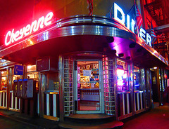
Well, looks like there's another reason not to bother going back to New York. My beloved Cheyenne Diner is finally closing down.
I used to work down the street, and spent many, many happy lunch hours there, enjoying almost perfect platters of grilled cheese with fries. It was also a favorite spot to drag anyone I ever had to meet in Midtown, and not just because I'll take any excuse to get a decent milkshake.
I can't say that I’m shocked about the closing. In fact, I’m amazed they resisted the pressure to cash in on that real estate for so long. Still, it's a shame to see another free-standing classic diner go away, especially one that felt a little like home every time I went inside.
The Cheyenne was the kind of place I have in my mind every time I crave the perfect diner experience, a thing that doesn't really exist in Boston or the UK, the only two other places I’ve ever lived. It's not the that food is incredible, but that it's just right: comforting, tasty, familiar, and not trying to be fancier than necessary. Most of the seats are booths lining the windows that look out on the street, with room to relax for one or two, or room to squeeze in a bigger group of pals. One of the waitresses would proudly show us pictures of her son in his dancing-school costumes, and occasionally give us free slices of cake.
(Tip o' the hat to Norm for catching this for me.)
All hope is not lost for American cities, though. One of the handful of things I really love in Los Angeles — Phillipe the Original, home of the French Dip sandwich and the 9¢ cup of coffee— is about to celebrate its 100th anniversary.
Very Barbara Pym
It is these asides, I think, that make Excellent Women so beguiling. The plot itself is not without interest, but it is the narrator's comments on her world and on the scraps of pleasure it allows her that are so utterly engaging; as where Mildred says, right at the beginning: " 'I have to share a bathroom,' I had so often murmured, almost with shame, as if I personally had been found unworthy of a bathroom of my own." To be found unworthy of having one's own bathroom is such an unexpected notion, but it is amusing because it is a cri de coeur of frustrated ambition, of a desire to be something that fate will clearly never allow one to be.
Metatextual Comics
I’ve pared my regular comics selection down to the bare minimum for the time being, so any time I buy a few books they're always something I love. There were a few especially brilliant bits in this week's assortment.
The first one is from the comic tie-in to a movie based on a comic, Justice League: The New Frontier. Observe as Rip Hunter — Time Master! — takes a swipe at continuity nerds (click to enlarge):

Next, some literary commentary on Hamlet from Jack of Fables:


Leave it to the viking to cut to the chase.